Pa i Punt — Imperfections into bold bakery branding in St Quirze
THE CHALLENGE
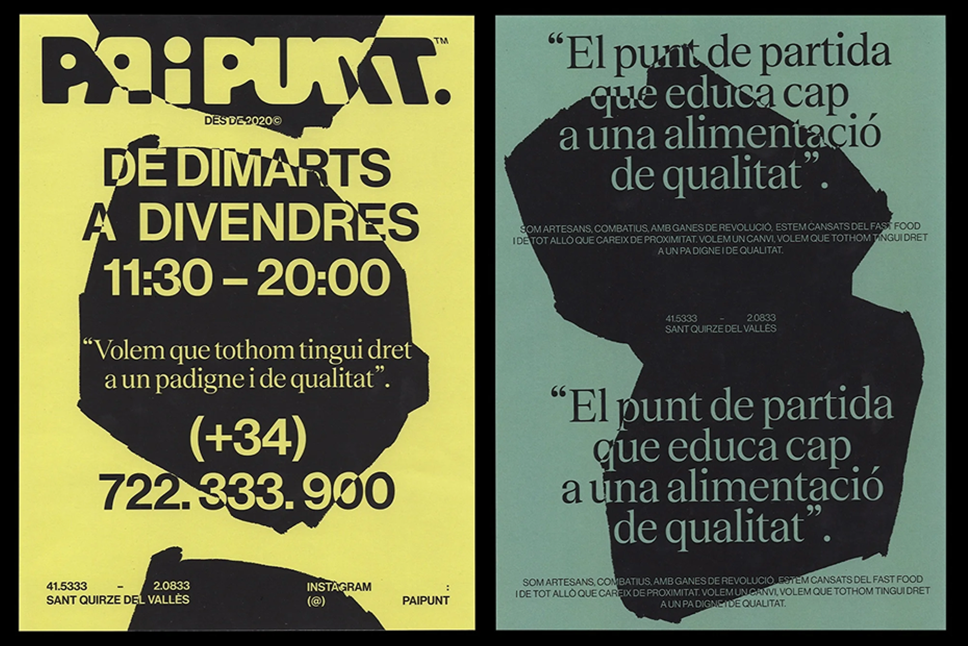
Artisanal bakery branding tends to gravitate towards the same familiar territory: warm tones, soft illustrations, comforting aesthetics. Safe, predictable and instantly forgettable. Pa i Punt needed something else. A brand that matched the rigour and conviction of the bread itself, one that felt like a statement rather than a decoration.
The tension was finding a visual language bold enough to stand apart from the category without losing the warmth and craft at the heart of the project.
THE APPROACH
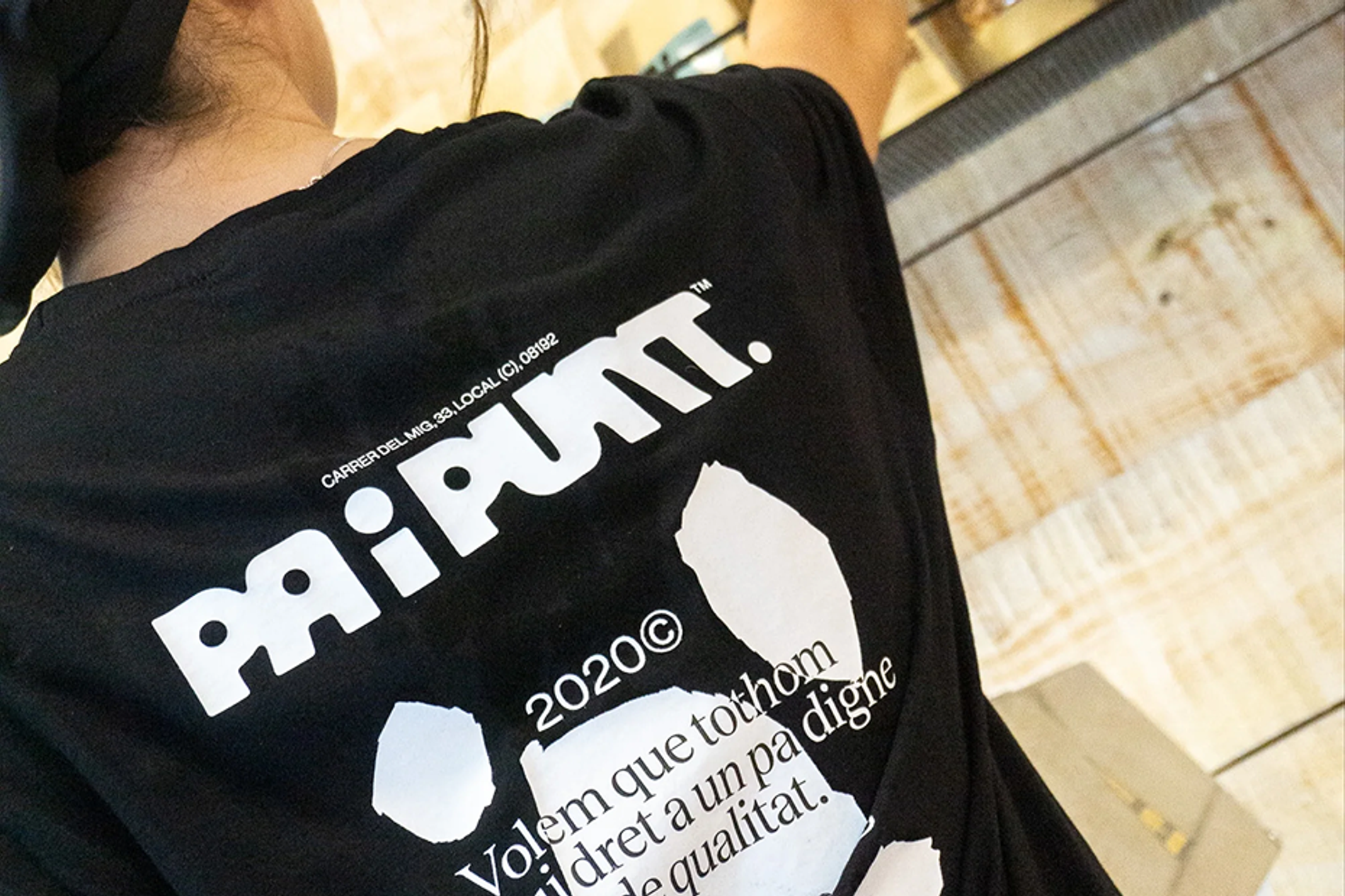
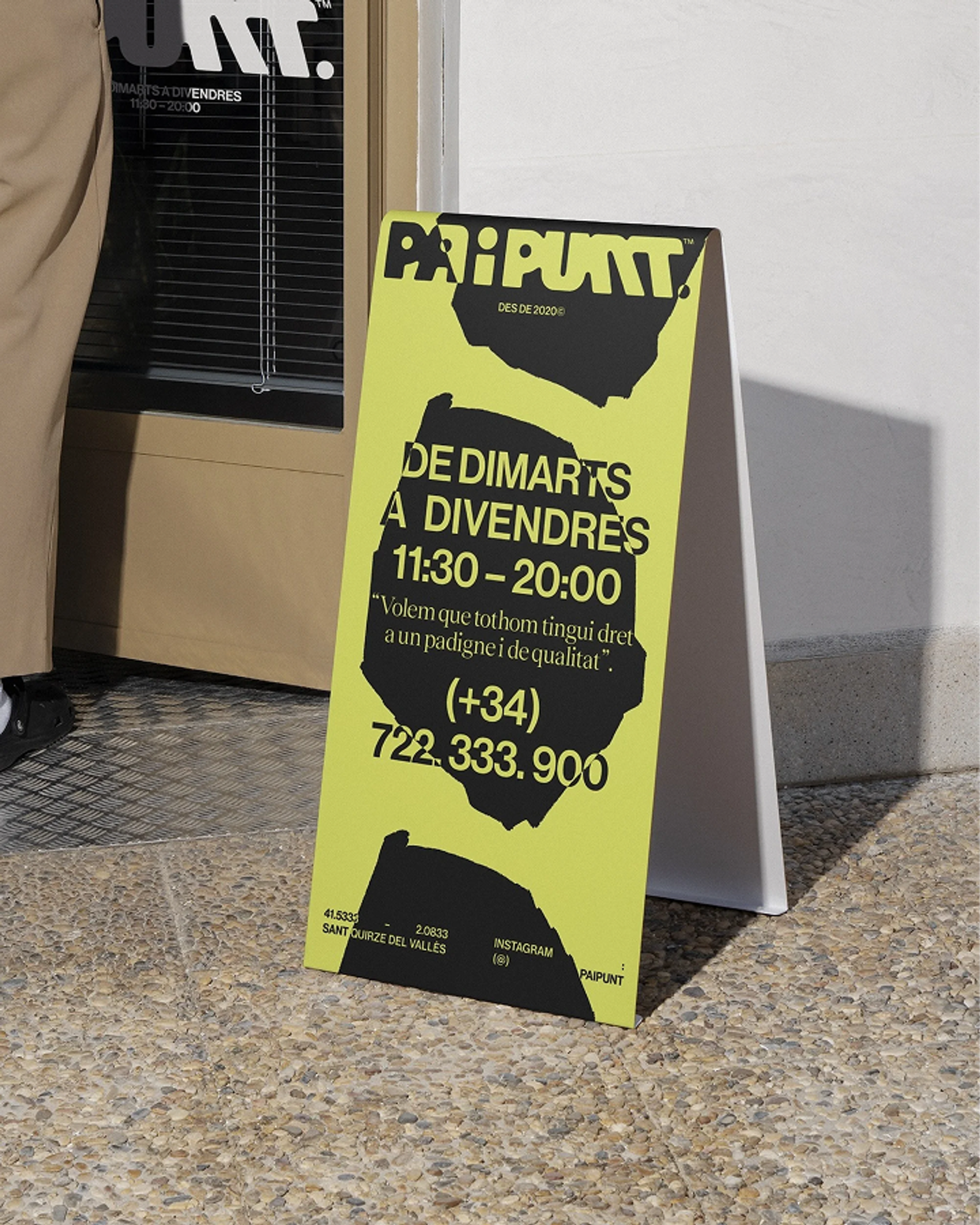
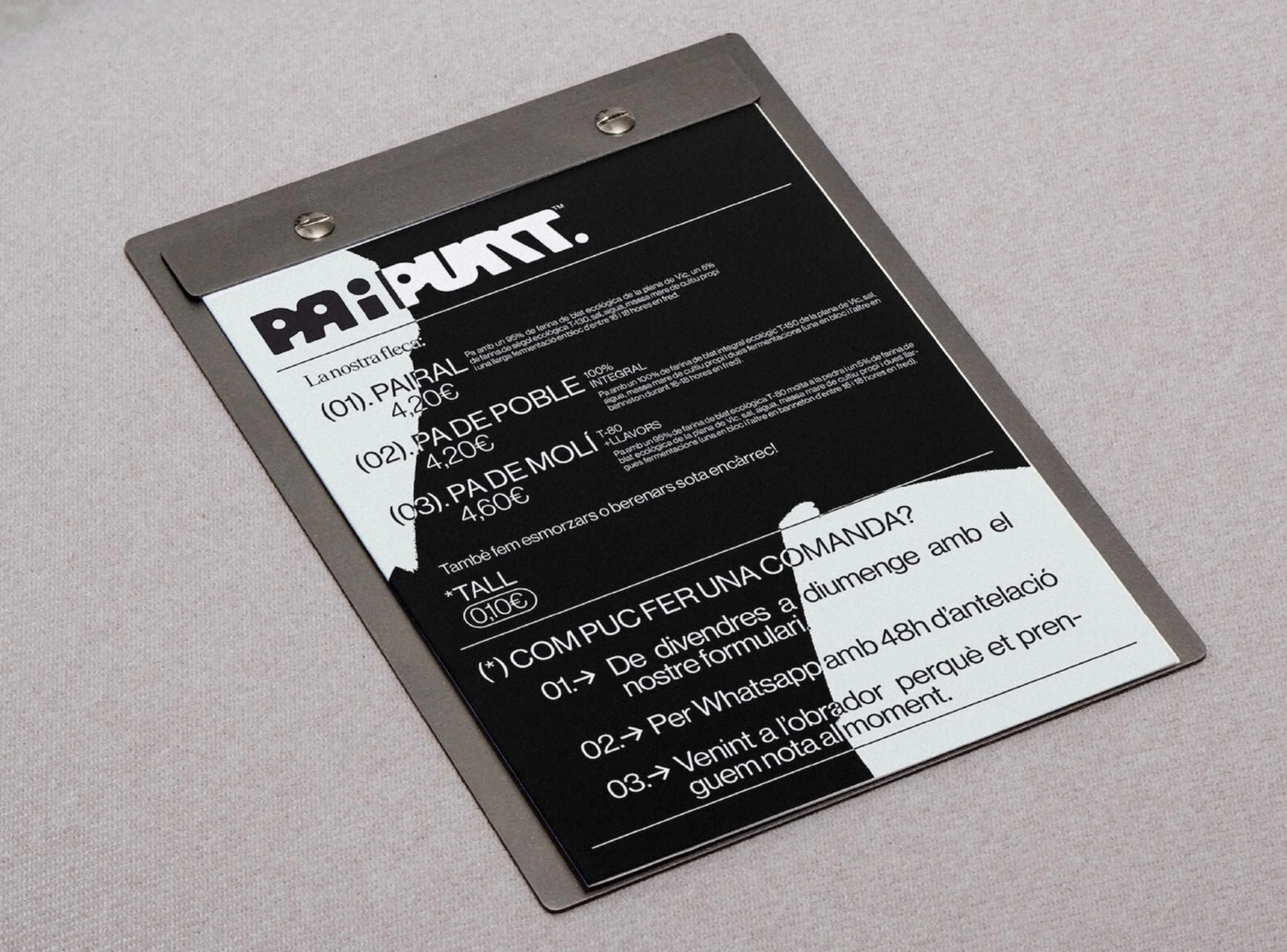
Our conversations with Aniol were a constant source of direction. His obsession with process, with the details that most people never notice, pointed us towards the most unexpected starting point: the imperfections. The cracks, bubbles and organic textures that emerge naturally during fermentation and baking became the raw material for the visual system. We developed those textures through a combination of analogue and digital techniques, embracing imperfection as both method and message. From that experimentation, a clear three-layer logic emerged and was then deliberately built into the system: a solid colour background, strong typographic compositions and disruptive organic forms that break into that order. Once defined, that logic became the practical framework that makes the system scalable and easy for Aniol to use and adapt independently, across packaging, signage, merchandise and spatial applications.
The imperfections were not a problem to solve. They became the raw material for the entire visual system.
THE WORK
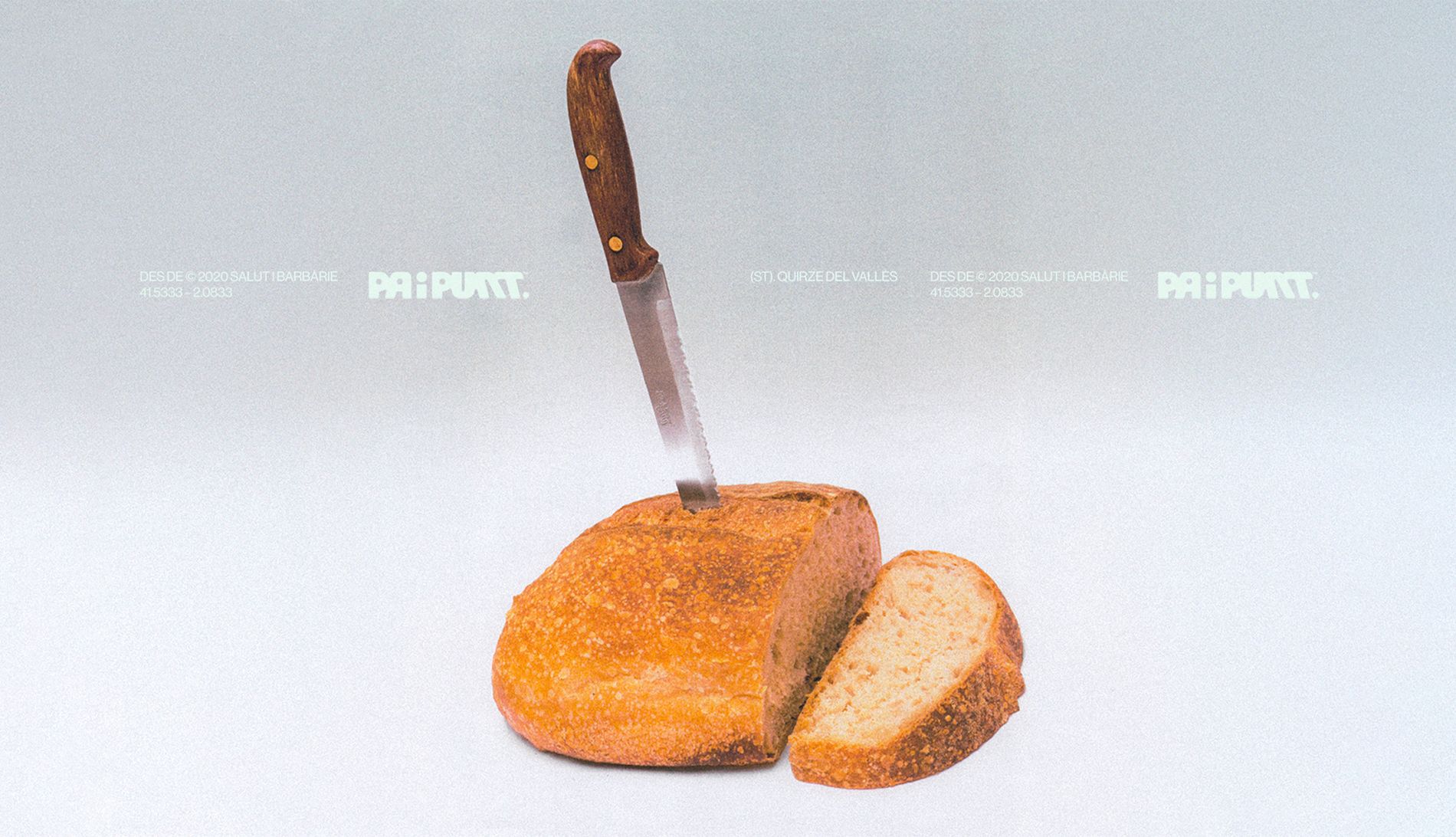
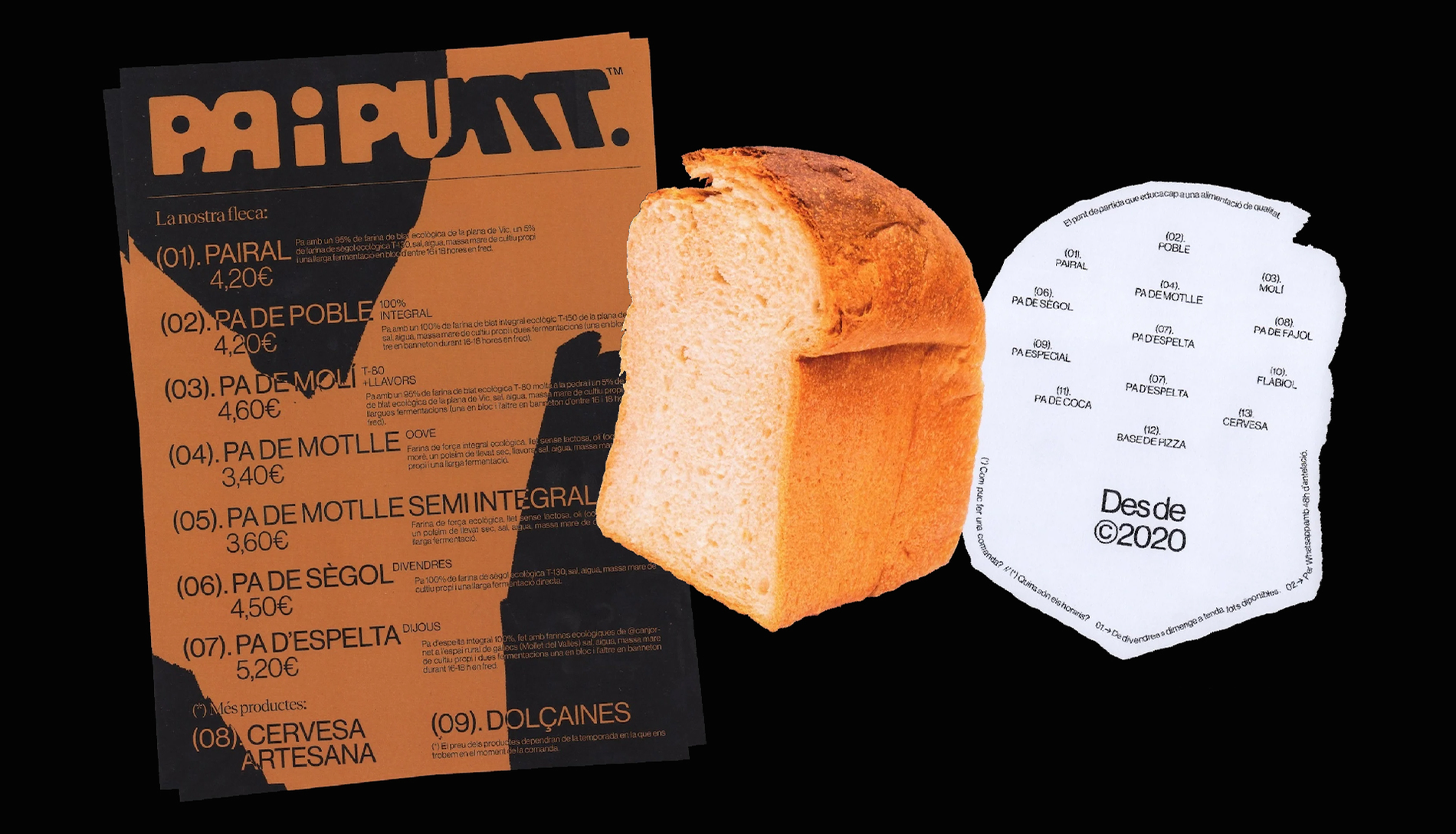
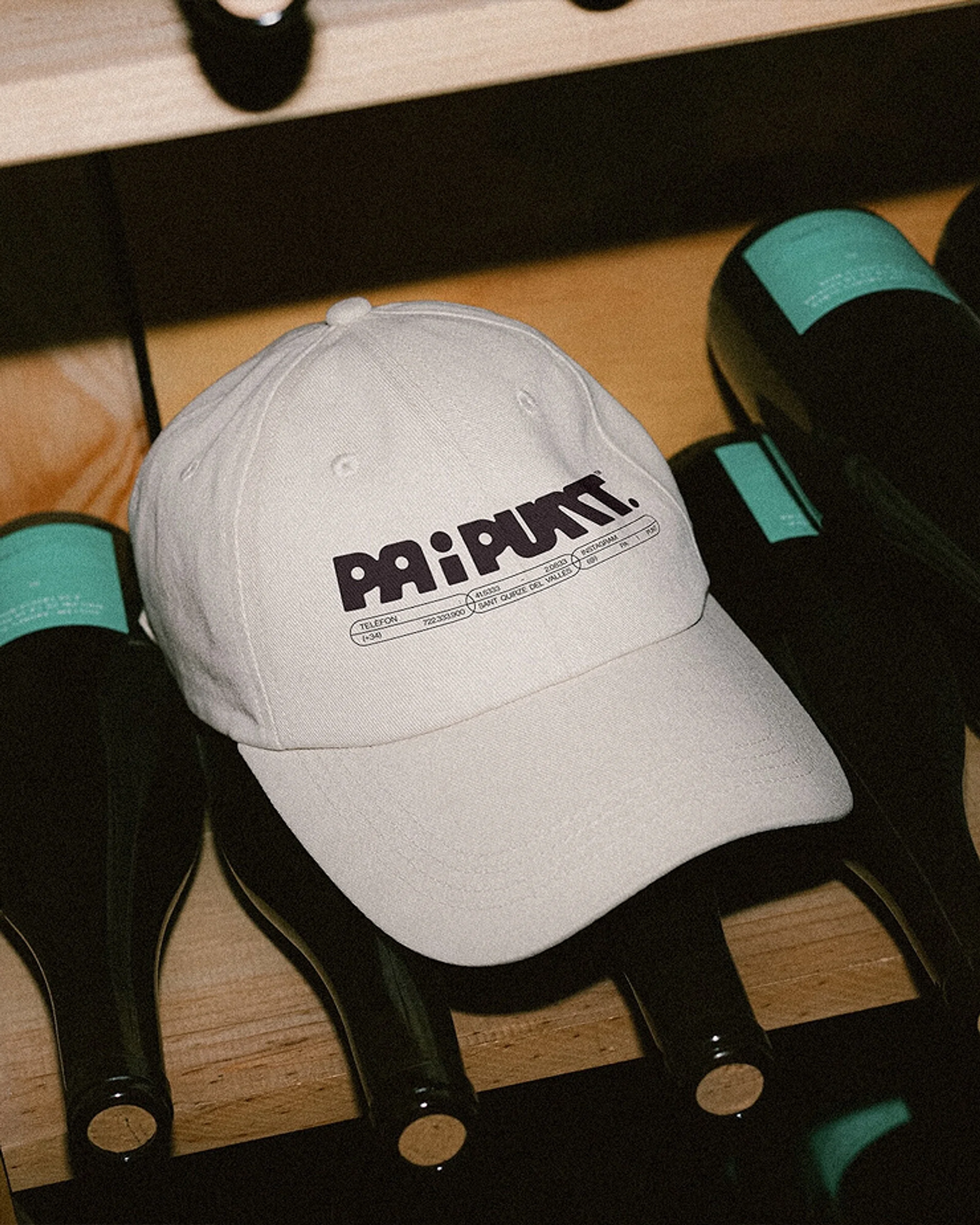
The identity pairs a typeface with a sharp, raw quality with a neutral grotesque that grounds the system and lets the more experimental elements breathe. The organic forms function as the disruptive layer: unpredictable in shape, consistent in logic. Their presence ensures the identity never settles into comfort. The system was applied across the full scope of the brand: visual identity, packaging, signage and in-store applications, and social media assets. Every touchpoint was considered as part of the same system, ensuring the identity remains experimental and dynamic whether encountered on a paper bag, a shop front or a screen. Modular by design, it gives Pa i Punt the tools to keep building the brand independently without losing coherence.
THE OUTCOME
Since redefining its positioning, Pa i Punt has built a stronger, more recognisable presence in its community. The brand now communicates with the same clarity and conviction as the bread itself, attracting an audience that values craft and intentionality as much as Aniol does. A brand built not to blend in, but to mean something: and its community has responded accordingly.