BOL Creative House — A living identity built for a roster that keeps growing
THE CHALLENGE
A production house is not a single author. It is a container for multiple creative personalities, each distinct, each contributing to a shared reputation. The identity needed to reflect that plurality without becoming inconsistent or diffuse. The logo had to function as a stable foundation whilst remaining genuinely open to the voices that inhabit it.
THE APPROACH
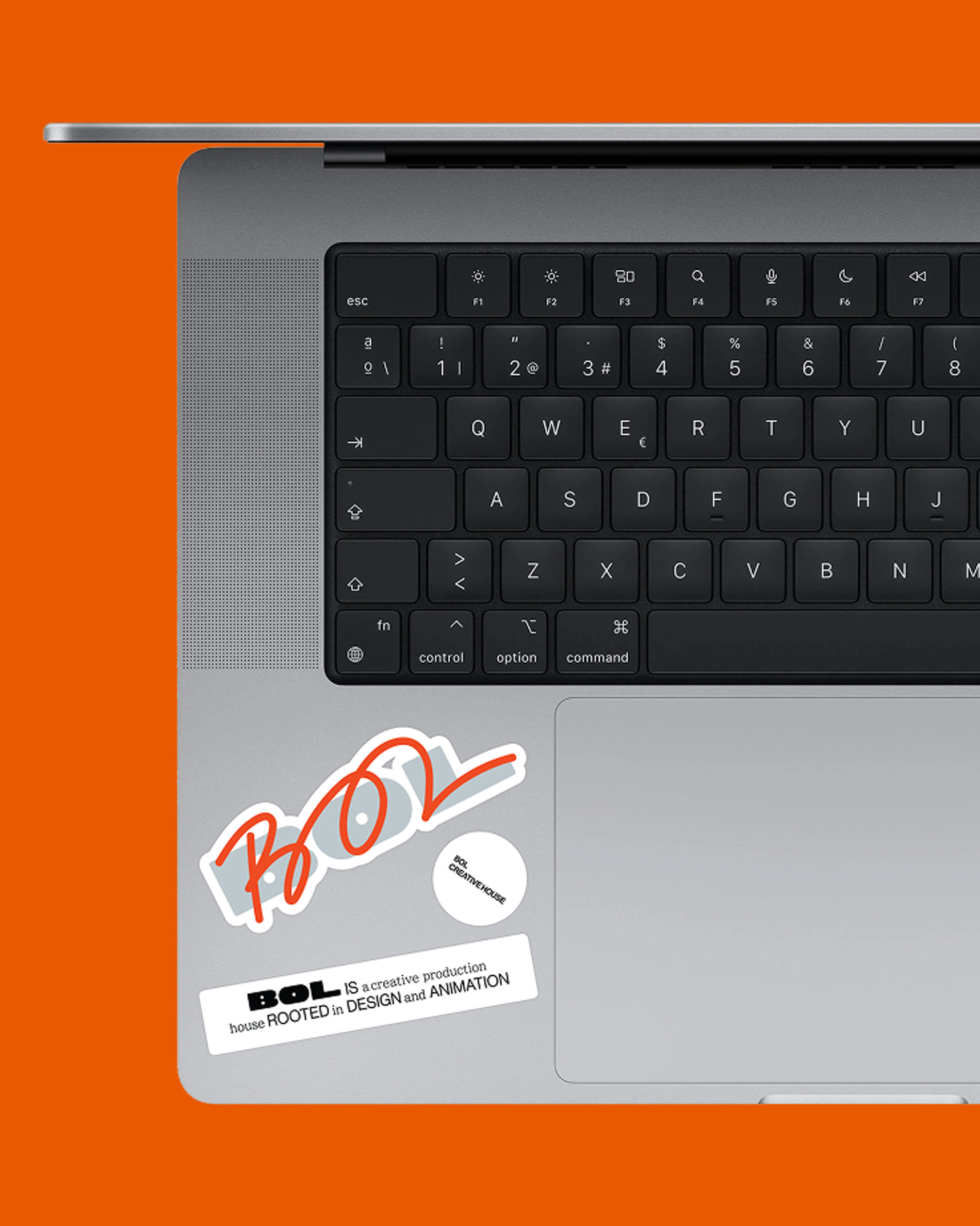
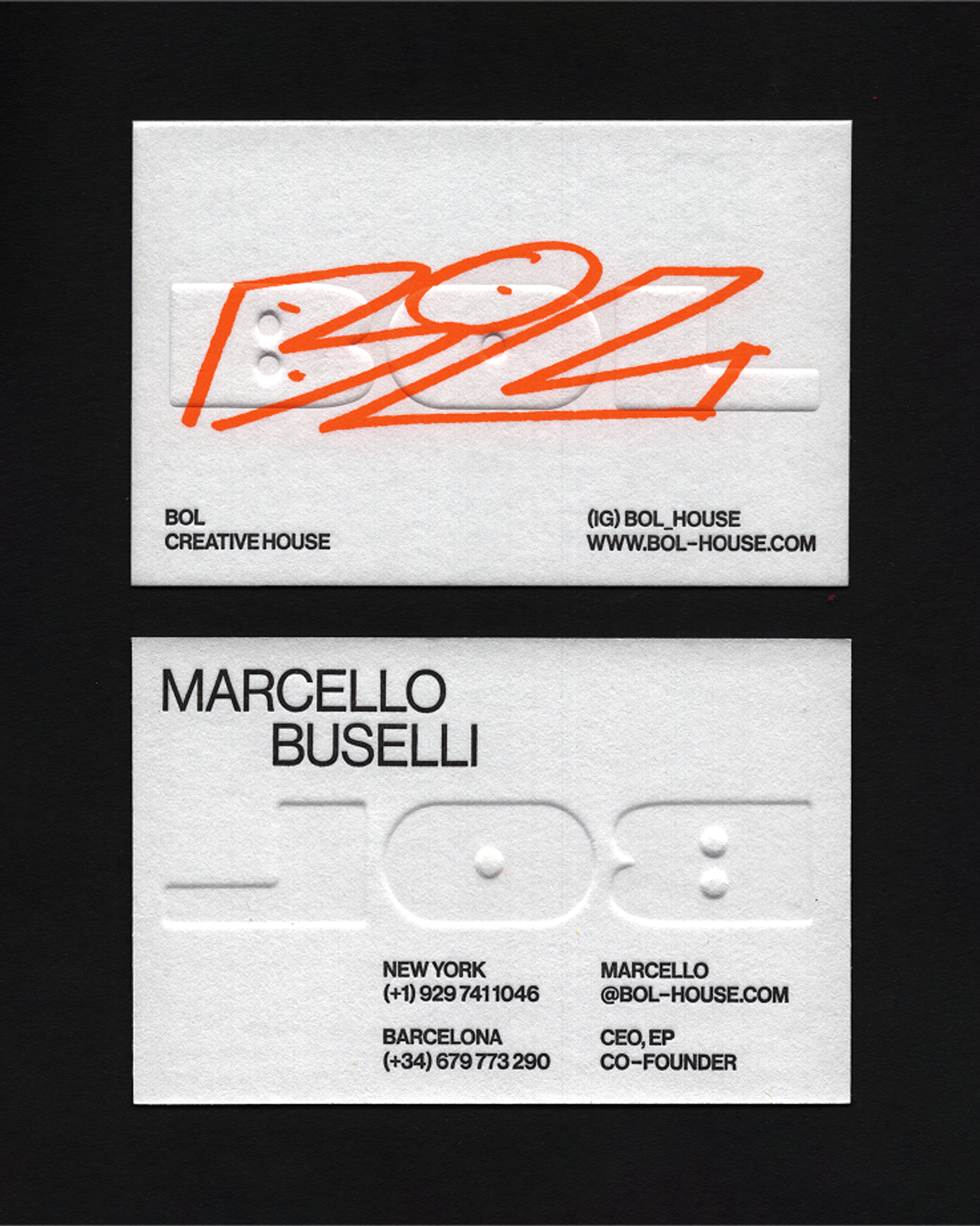
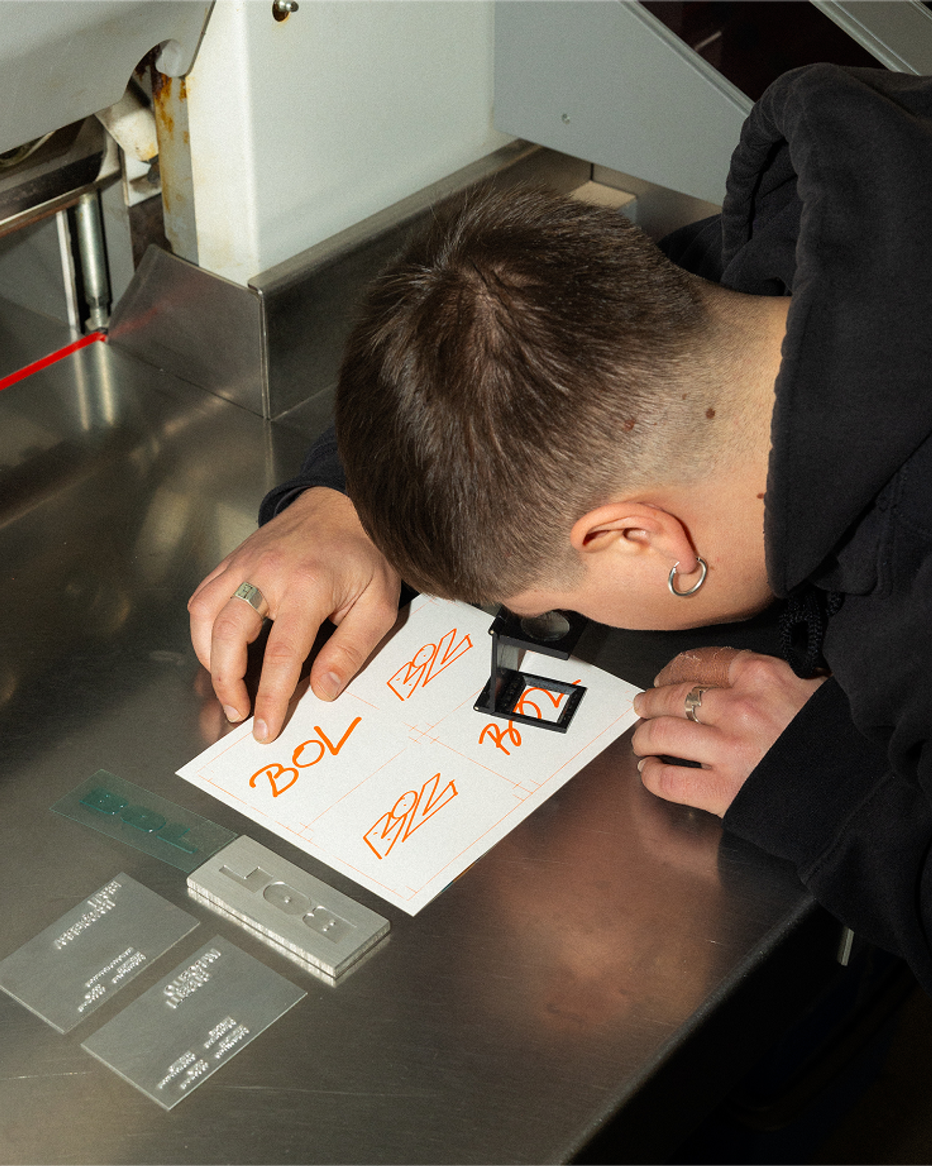
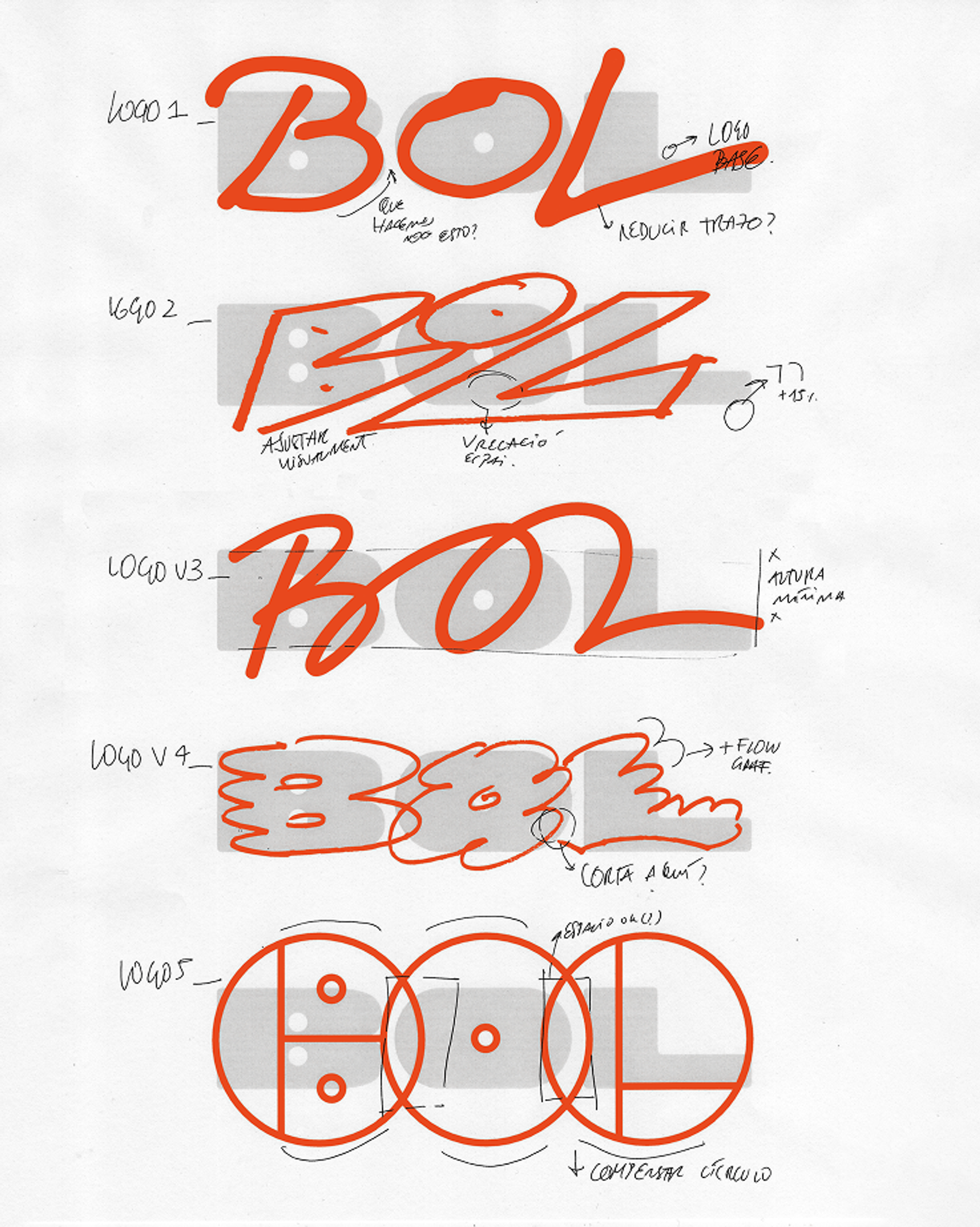
We took the concept of Expansive Movement as our starting point and built a logo that holds two things simultaneously: a fixed form combining shape and typography that represents BOL as an institution, and a layer above it that belongs to whoever is leaving their mark on it.
The logic is structural. The logo sits as the permanent ground, the production house itself. The lettering sits above it, the trace of each creative personality passing through. We designed an initial set of nine letterings to launch the system, each distinct in character, each legible as part of the same world. The intention from the outset was for BOL to expand that set over time as their roster grows, making the identity genuinely alive rather than fixed at launch.
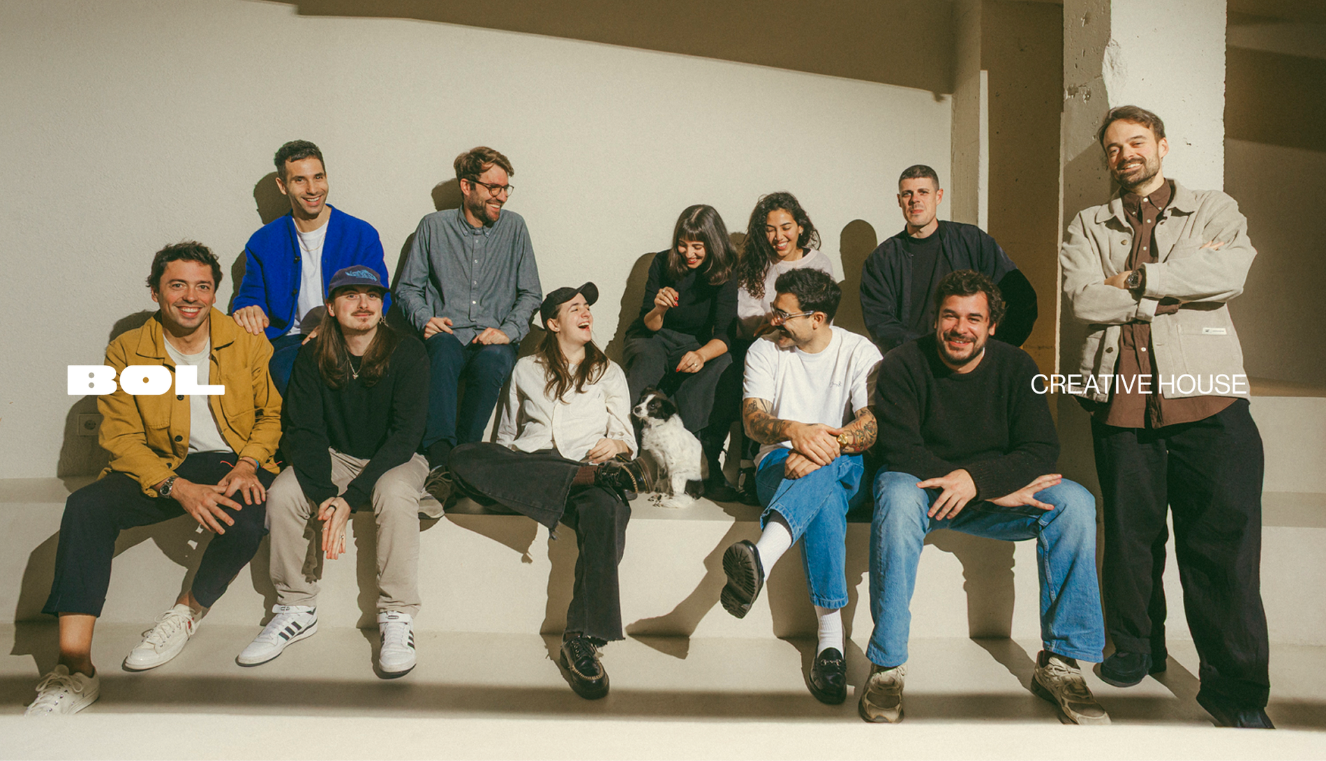
A production house is not a single author. The identity needed to reflect that plurality without becoming inconsistent or diffuse.
THE WORK
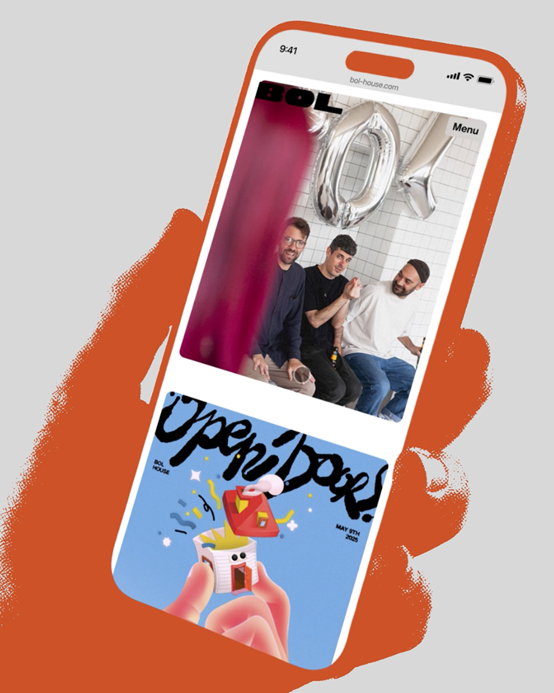
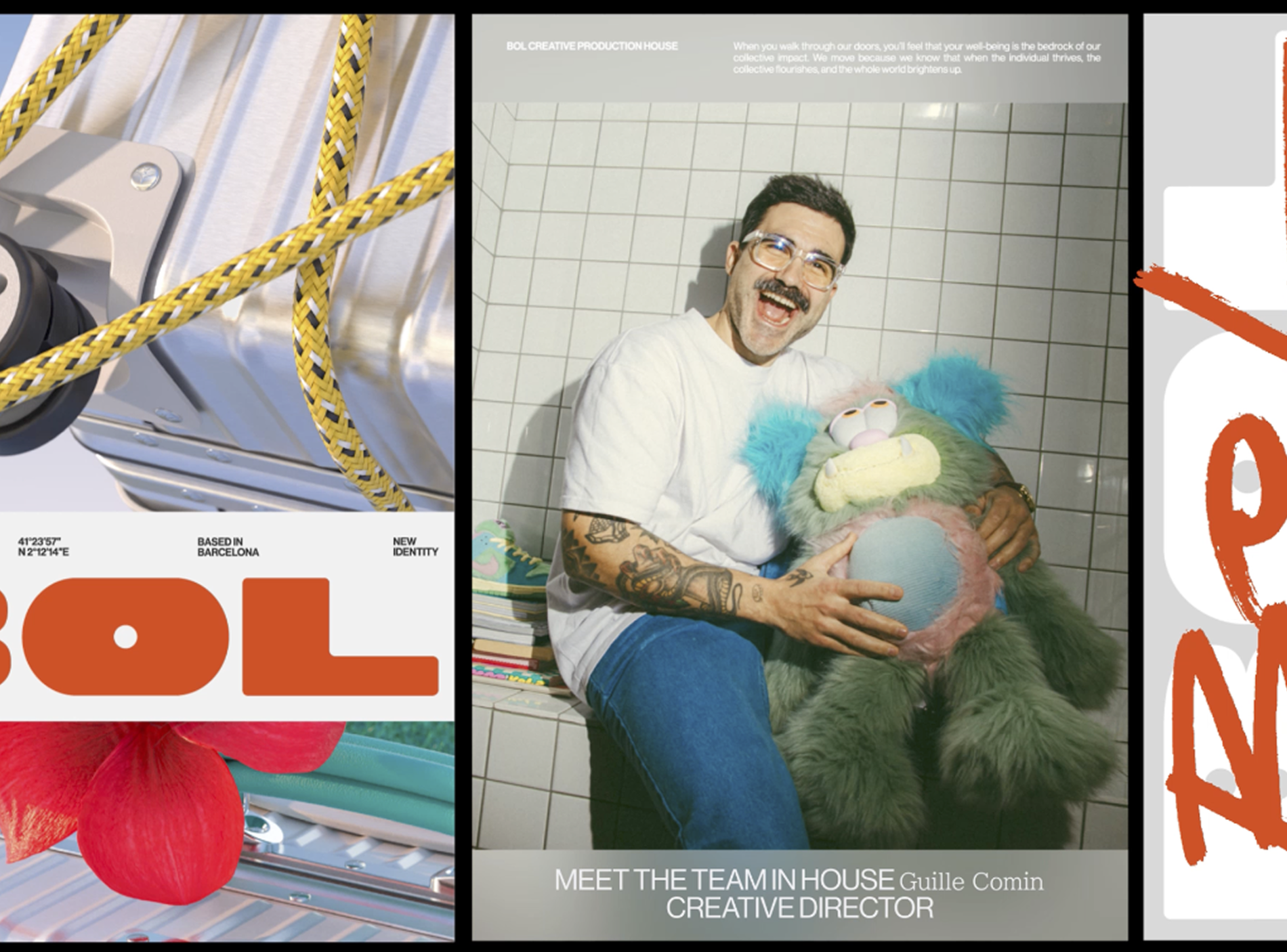
We delivered an end-to-end branding system across the full scope of the project: brand identity, corporate assets and website. Every touchpoint was built from the same structural logic, ensuring the Expansive Movement concept remained coherent whether encountered on screen, in print or across BOL's digital presence.
THE OUTCOME
BOL now has a brand system that grows with the people inside it. The more voices that contribute to the lettering layer, the richer and more representative the identity becomes. It is not a logo that describes what BOL does: it demonstrates it, by being built the same way BOL works.