
New Producers Academy — A brand strategy built with the people who live it
THE CHALLENGE
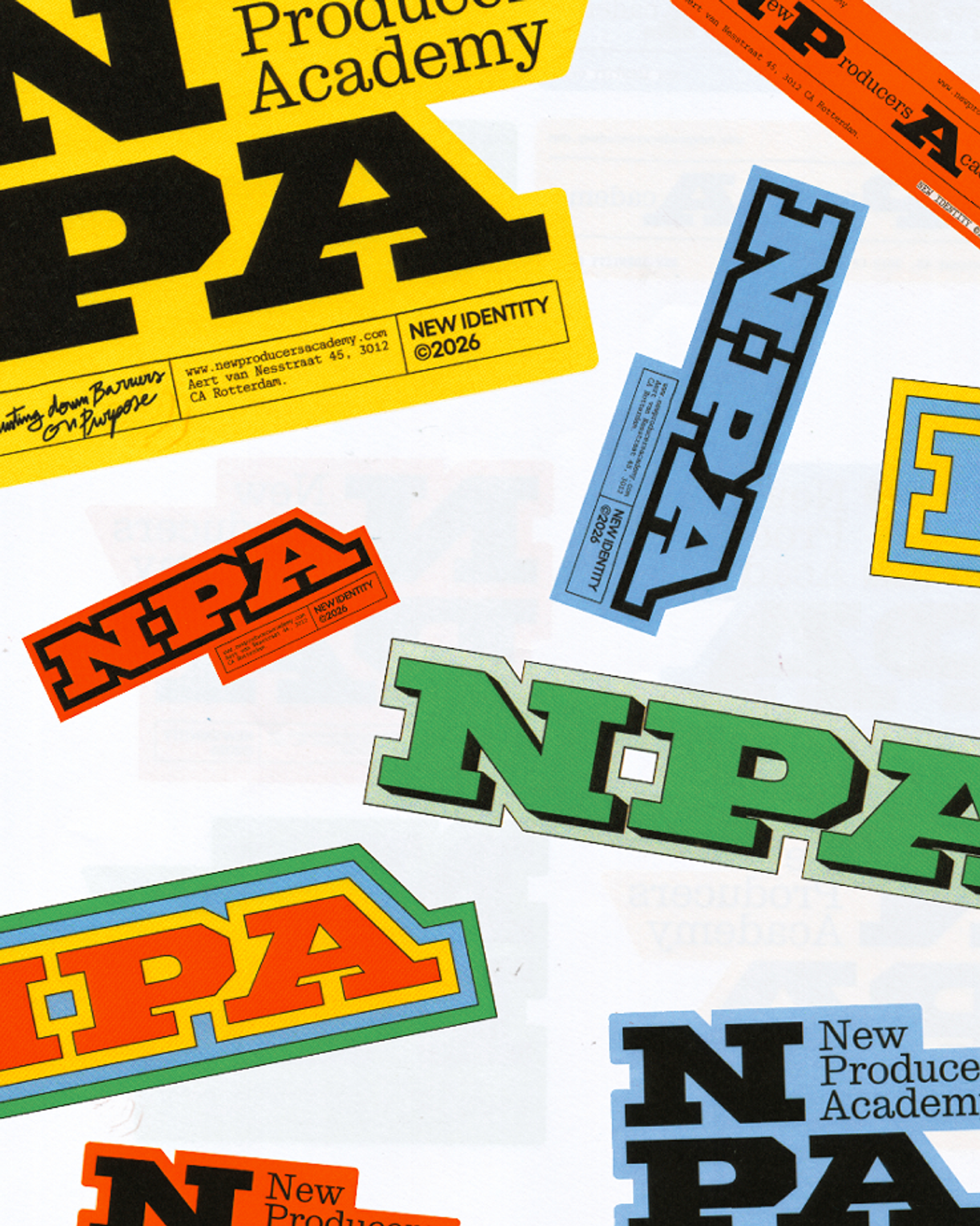
Designing for a purpose built on access carries a specific responsibility: the brand couldn't afford to feel like a well-intentioned statement with nothing behind it. It needed to feel as real, as hands-on and as in-progress as the craft of producing itself. The risk was landing on a generic "school for everyone" aesthetic that ended up resonating with no one.
NPA needed an identity that was a direct reflection of its mission: opening the door to those who have historically been kept out of it, without losing an ounce of character in the process.
THE APPROACH
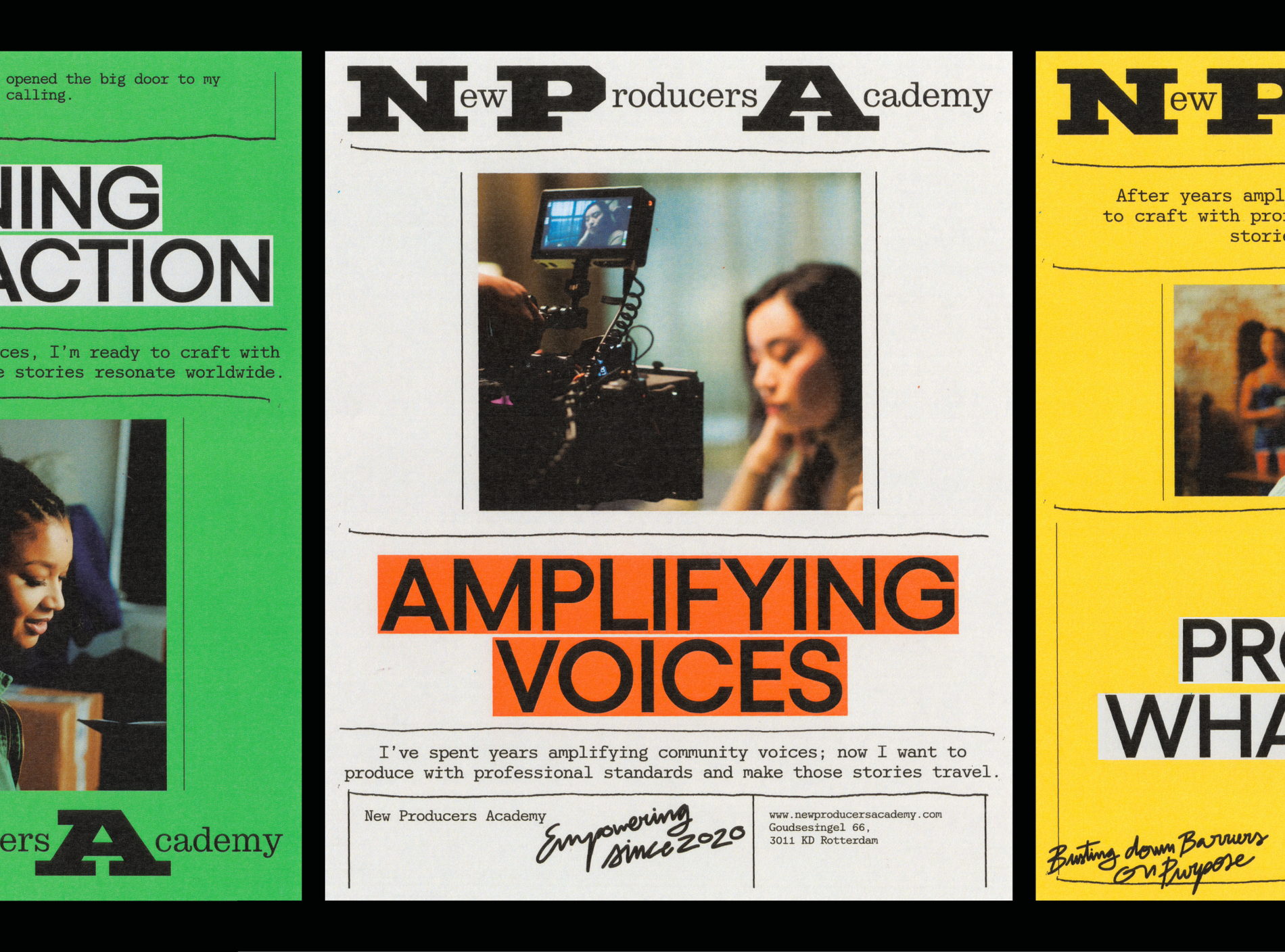
Working with the full NPA team was one of those rare processes where strategy and creativity moved together from day one. True to how we work, we didn't arrive with a closed off proposal. We ran a series of workshops with the team to open up the brief from multiple angles, questioning early assumptions and pressure testing ideas together before committing to a direction. That collaborative exploration surfaced the line that would go on to shape everything else: Produce What Matters. This wasn't a naming exercise. It was the synthesis of something the team had been trying to articulate for a while: that producing isn't just managing an industry, it's deciding which stories deserve to exist and who gets the opportunity to tell them.
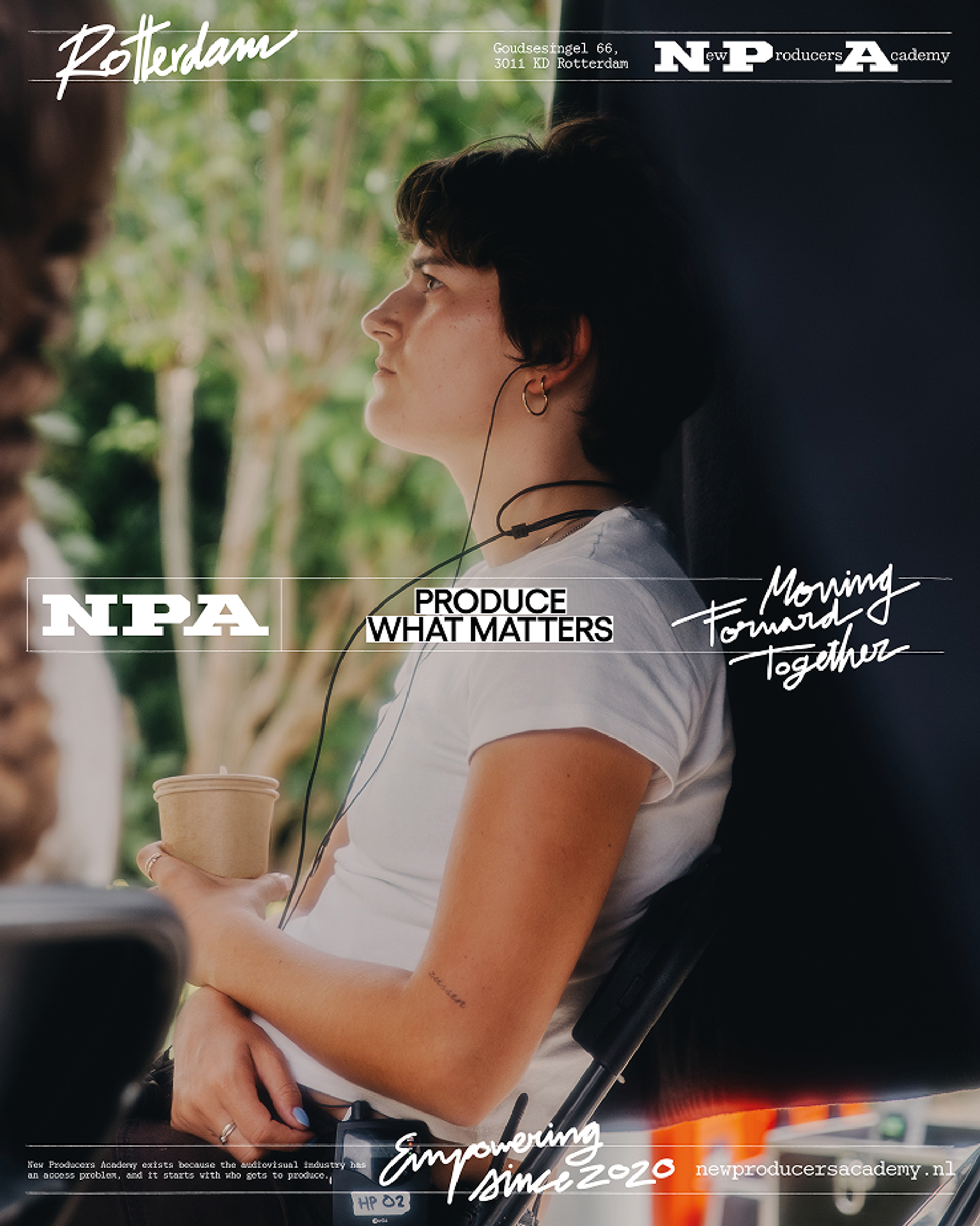
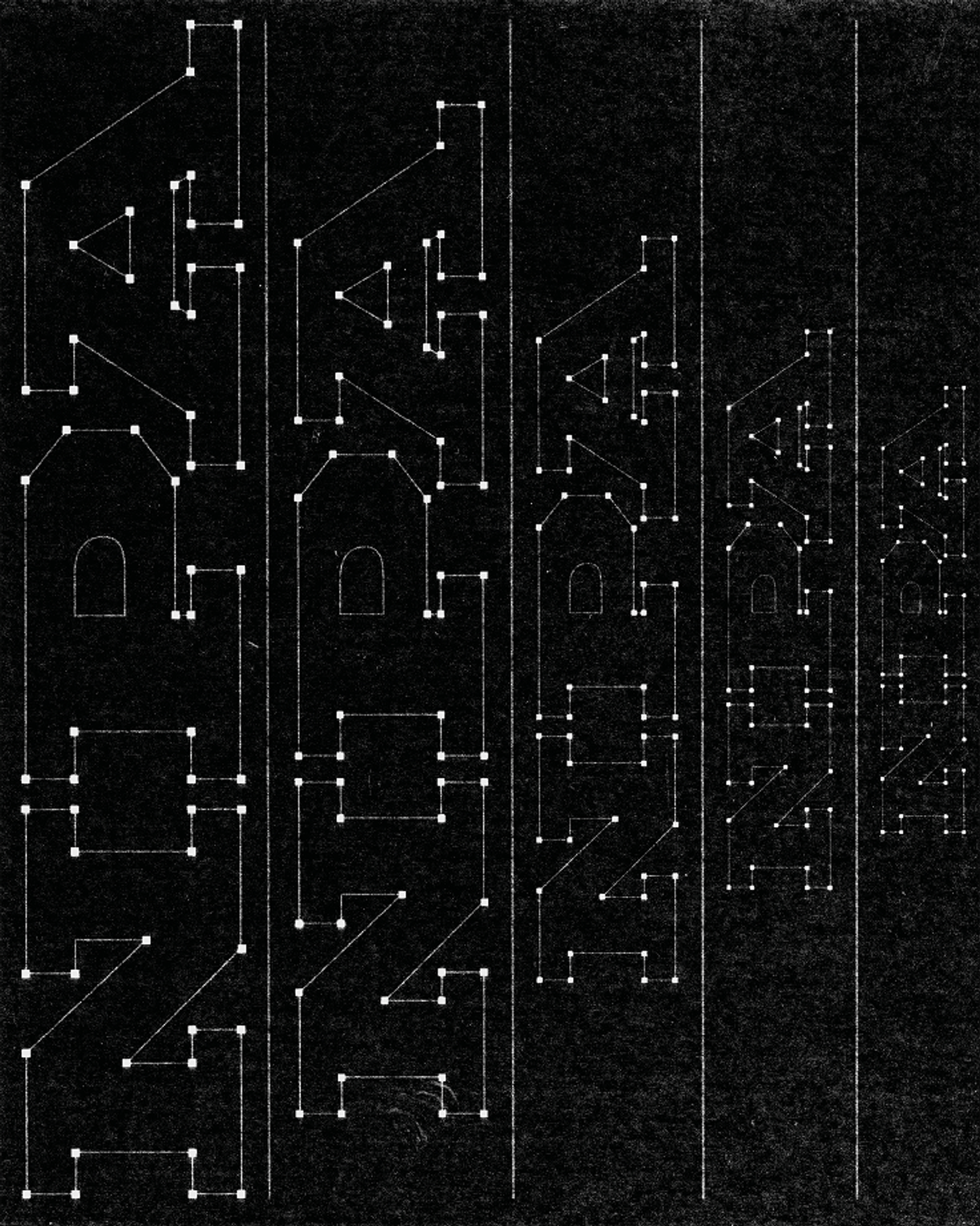
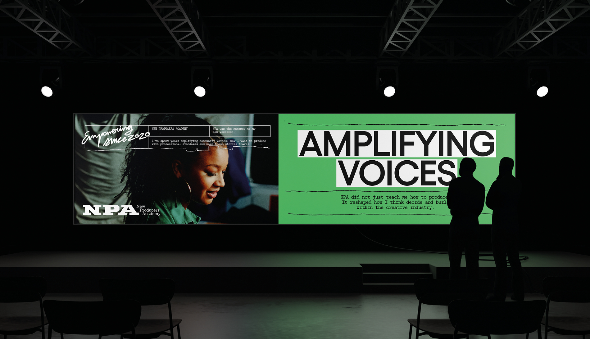
To build the visual system, we looked at the aesthetic codes of the great academies of the 50s and 70s and pulled them apart, rebuilding them through the tools of a producer's everyday: underlining, crossing out, analogue marks that feel working, alive and in progress. Every mark was treated as evidence of a decision being made in real time, never as a finished flourish.
Produce What Matters wasn't a naming exercise. It was the synthesis of something the team had been trying to articulate for a while.
The logotype and typographic system were built to hold that same tension: structured enough to feel institutional, loose enough to feel handled. Scanned textures, imperfect strike throughs and margin style annotations run across the identity, translating the producer's process of reading, marking and revising into a visual language. Nothing in the system was designed to look pristine; everything was designed to look used. A producer doesn't work in abstractions, they work with marked up scripts, notes in the margins, decisions made on the go. We wanted the brand to behave the same way a producer does: worked, not designed.
THE WORK
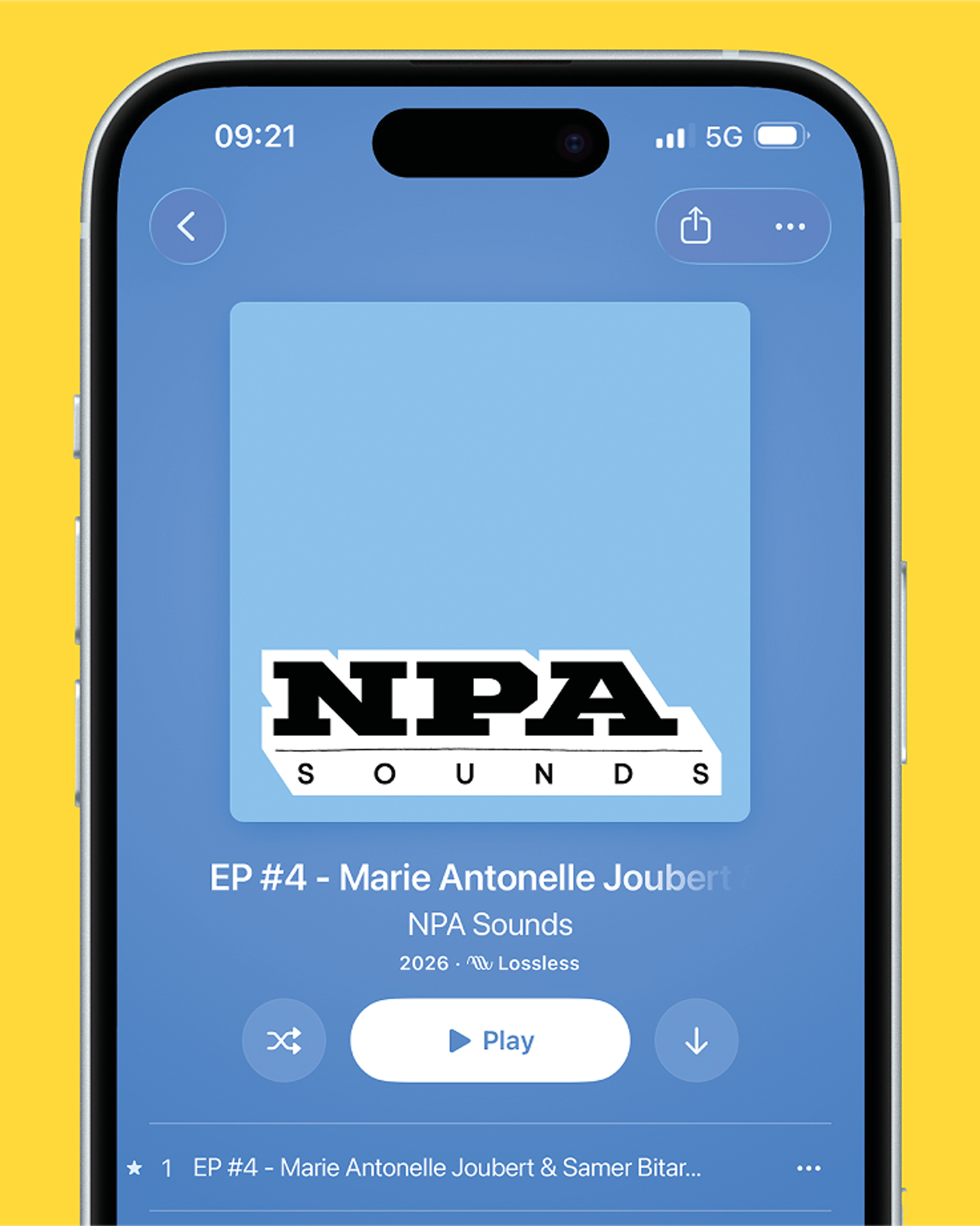
We delivered an end to end system: brand identity, art direction, brand strategy and website, all built from the same logic so the identity stays coherent whether encountered on screen, in print or across NPA's touchpoints.
THE OUTCOME
NPA now has a brand that doesn't illustrate its mission from the outside, but embodies it in every graphic decision. An identity as in progress, hands on and committed as the producers it trains.