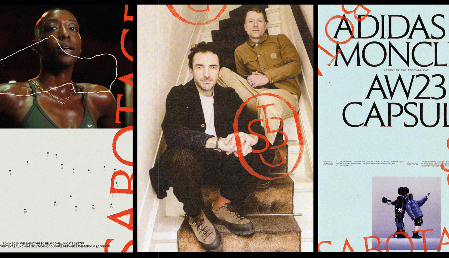
Sabotage Agency — Building a brand around the act of disruption itself
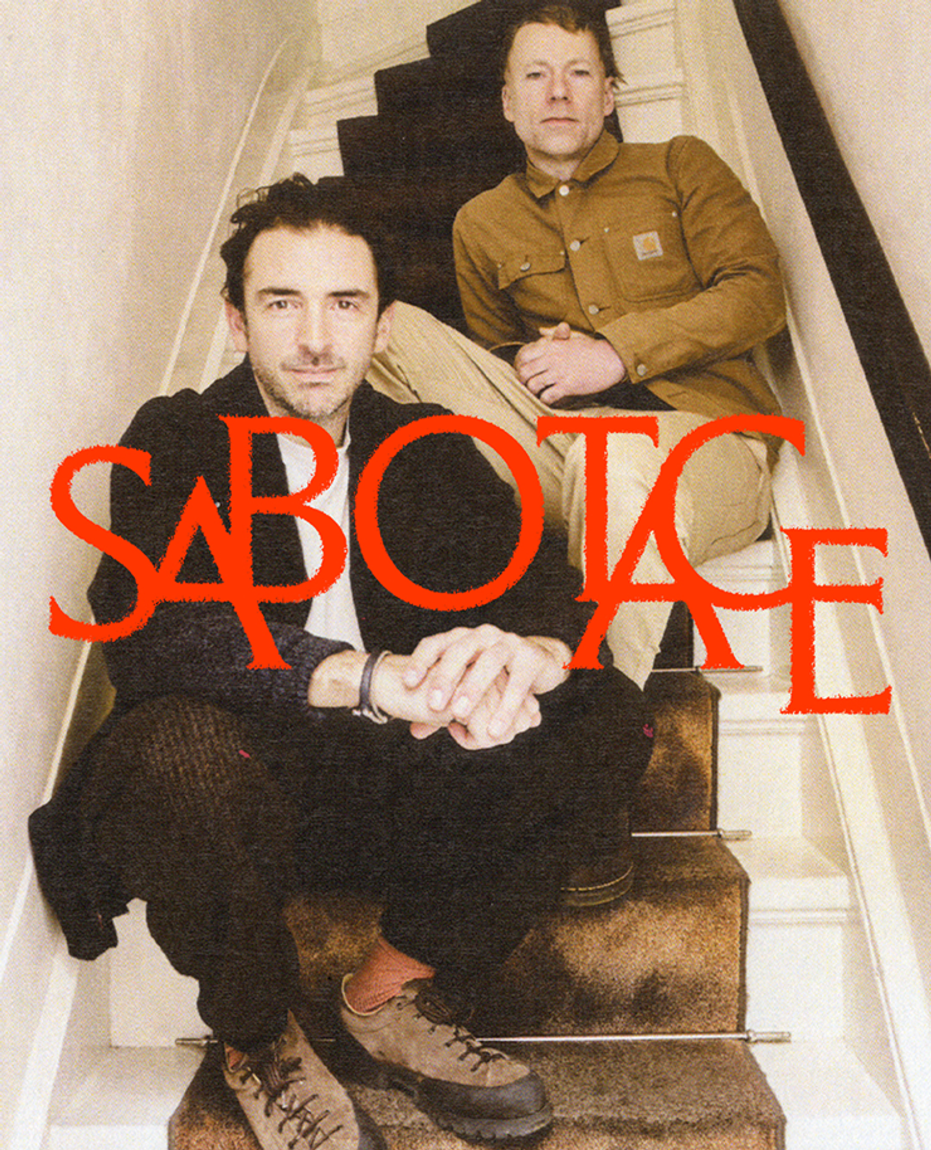
THE CHALLENGE
A brand called Sabotage that behaves like every other agency doesn't sabotage anything. It simply disappears into the noise. The real tension was this: how do you build an identity system for an agency whose core value is dismantling established systems? Without a visual language that matched the promise, the name risked becoming empty irony.

THE APPROACH
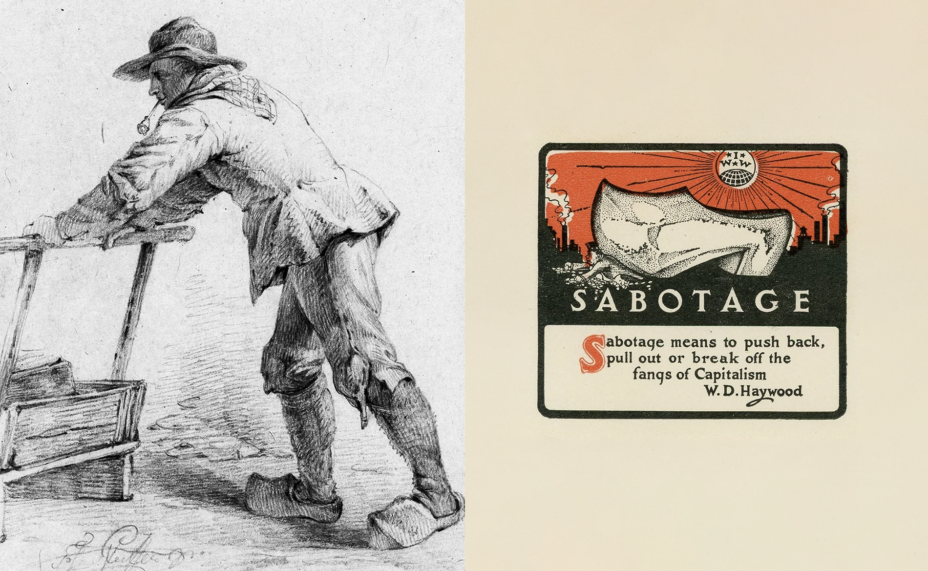
From the French sabot, the wooden shoe worn by 19th-century workers, comes both the brand's name and its strategic foundation. Popular myth holds that workers threw these clogs into factory machinery as an act of protest, halting production with nothing more than a wooden shoe.
Verified or not, the sentiment stuck: when a system fails you, you find a way to jam it. That image became a symbol adopted by radical labour movements across Europe, precisely because a small, deliberate intervention could carry disproportionate consequences.
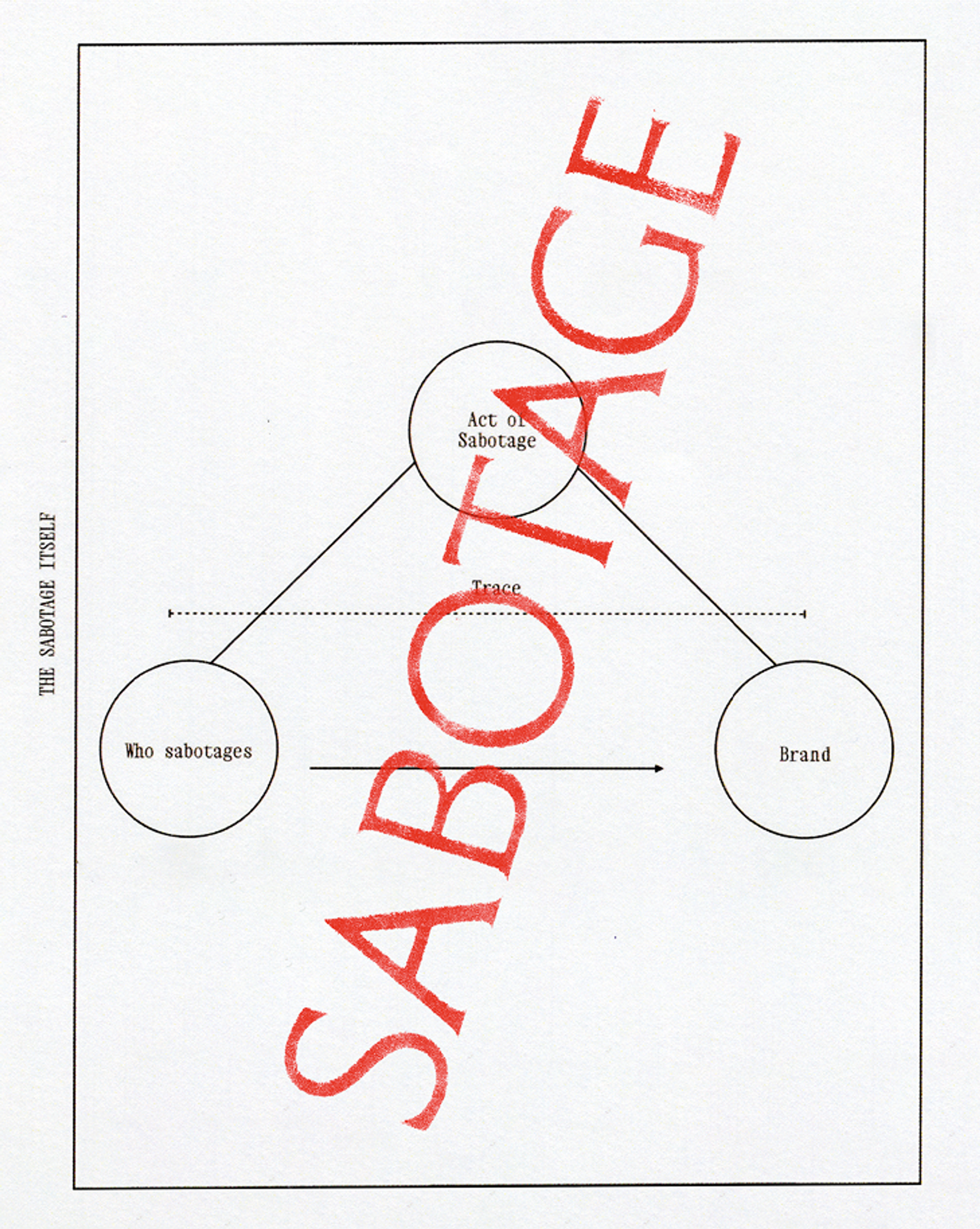
That origin shaped the project's entire architecture. Sabotage reclaims that spirit, not destruction for its own sake, but disruption with intent, building something better in its place. We defined a rational system only to disrupt it from within, structured around three interdependent layers: The Saboteur — the creative duo, the agent of intervention. The Sabotaged — the established industry, the target of disruption. The Trace — the visual echo left behind, proof that something happened.
When systems fail to serve you, you find a way to jam them. From that conviction comes both a name and an entire strategic identity.
THE WORK
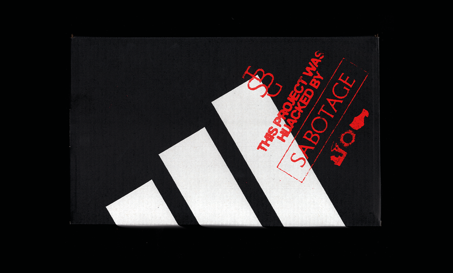
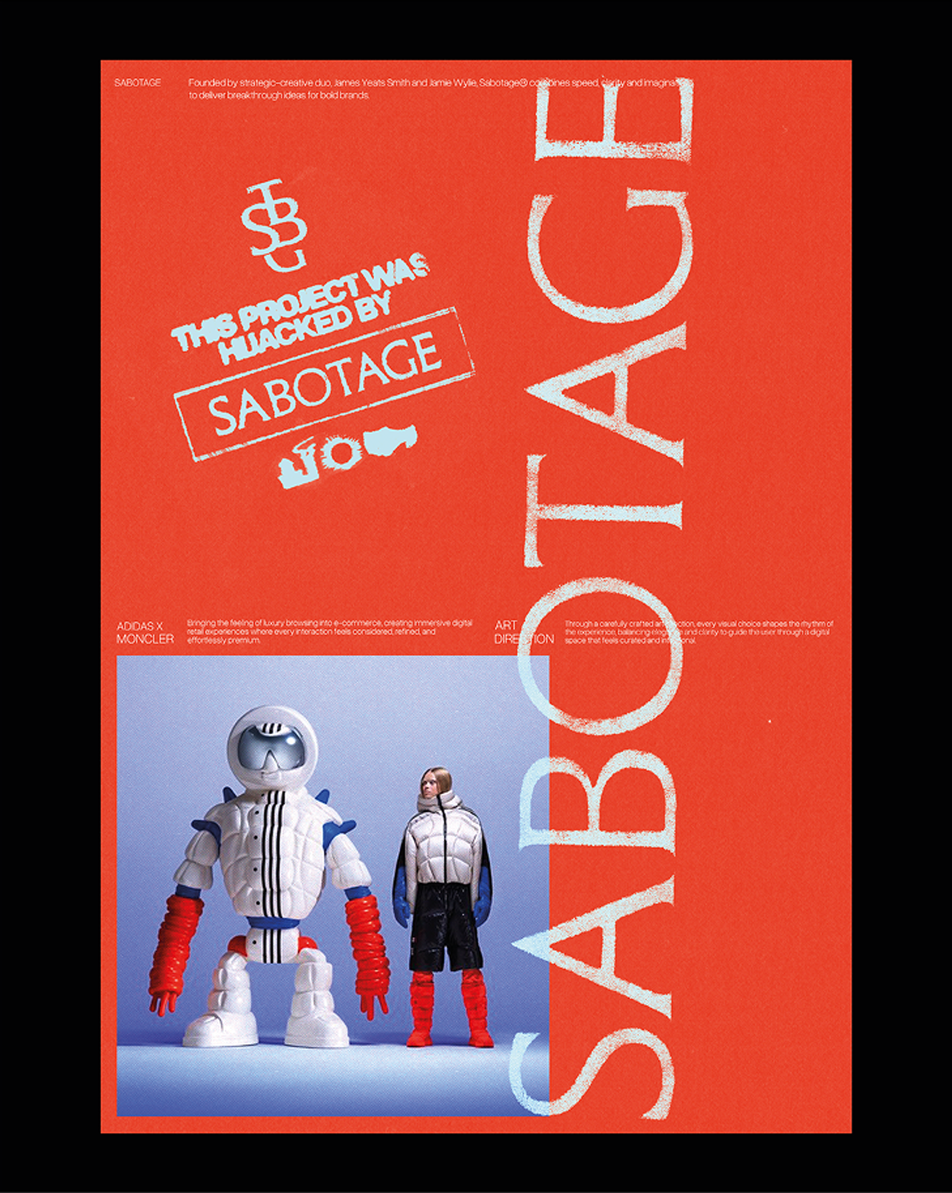
We took an existing typeface and intervened: the result breaks its own equilibrium, oscillating between legibility and tension, between order and interference. The typographic gesture is itself an act of sabotage. The stamps function as signatures of authorship, a physical trace documenting that the Saboteur was here. In a sector where agencies tend to disappear behind their clients' work, the stamps do the opposite: they assert presence, deliberately and traceably.
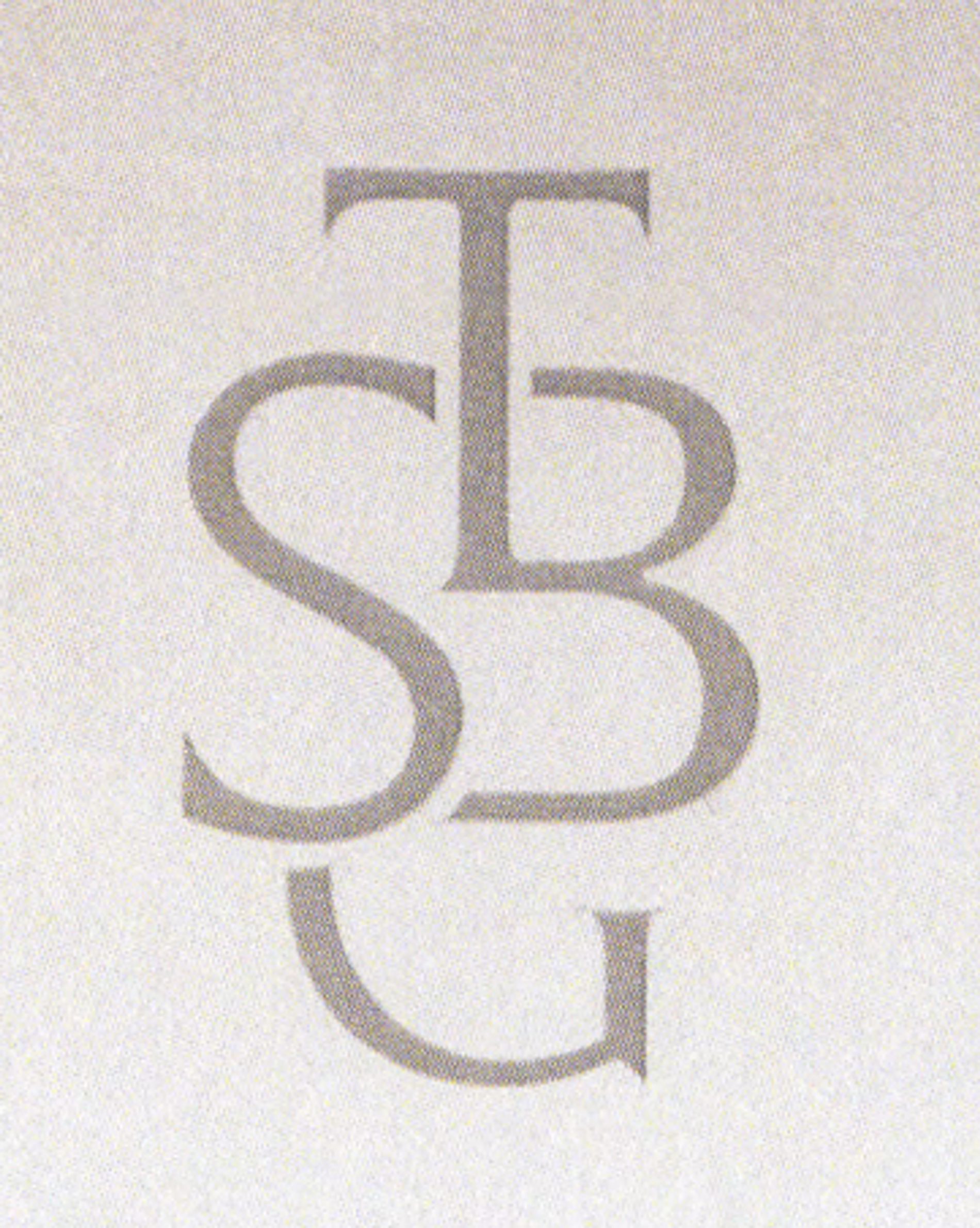
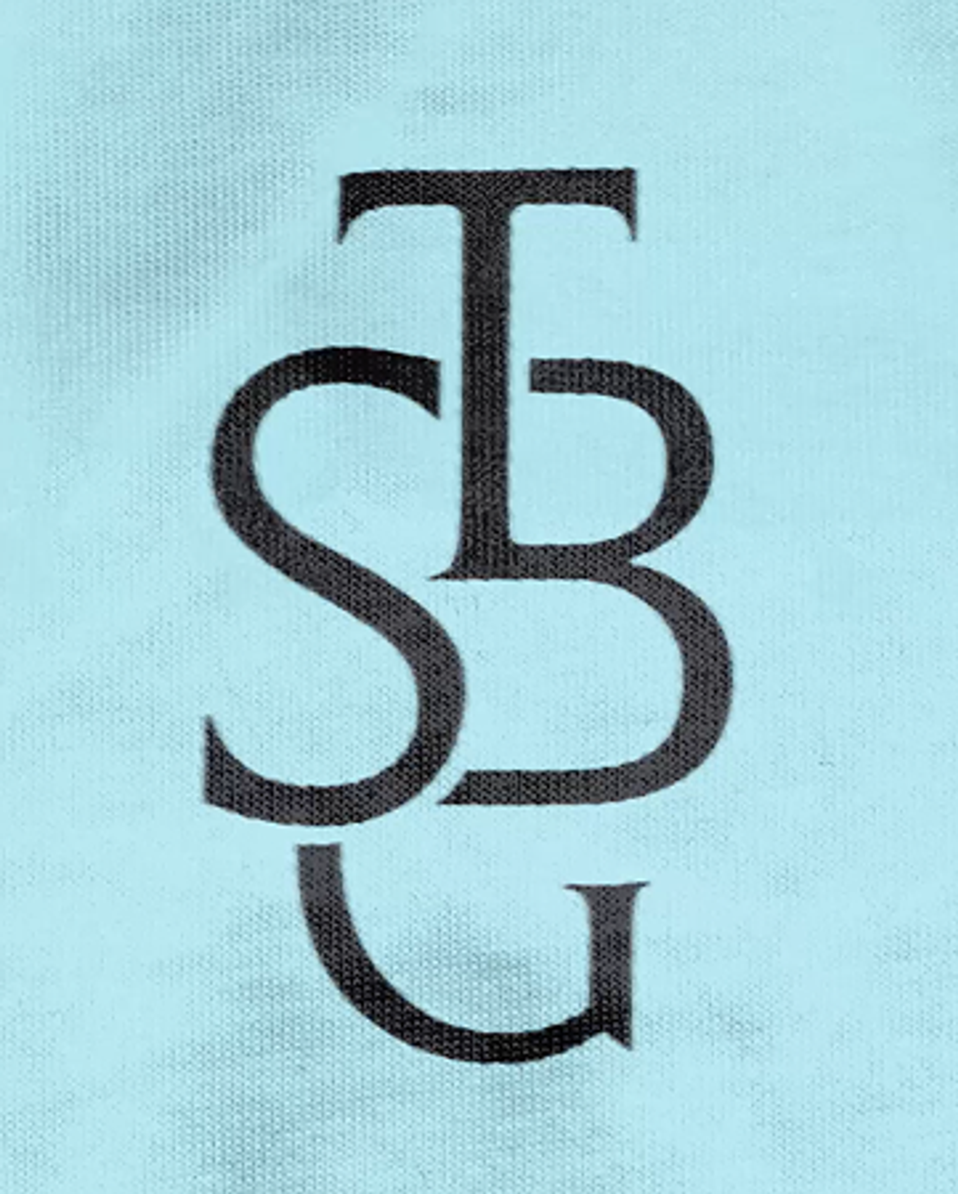

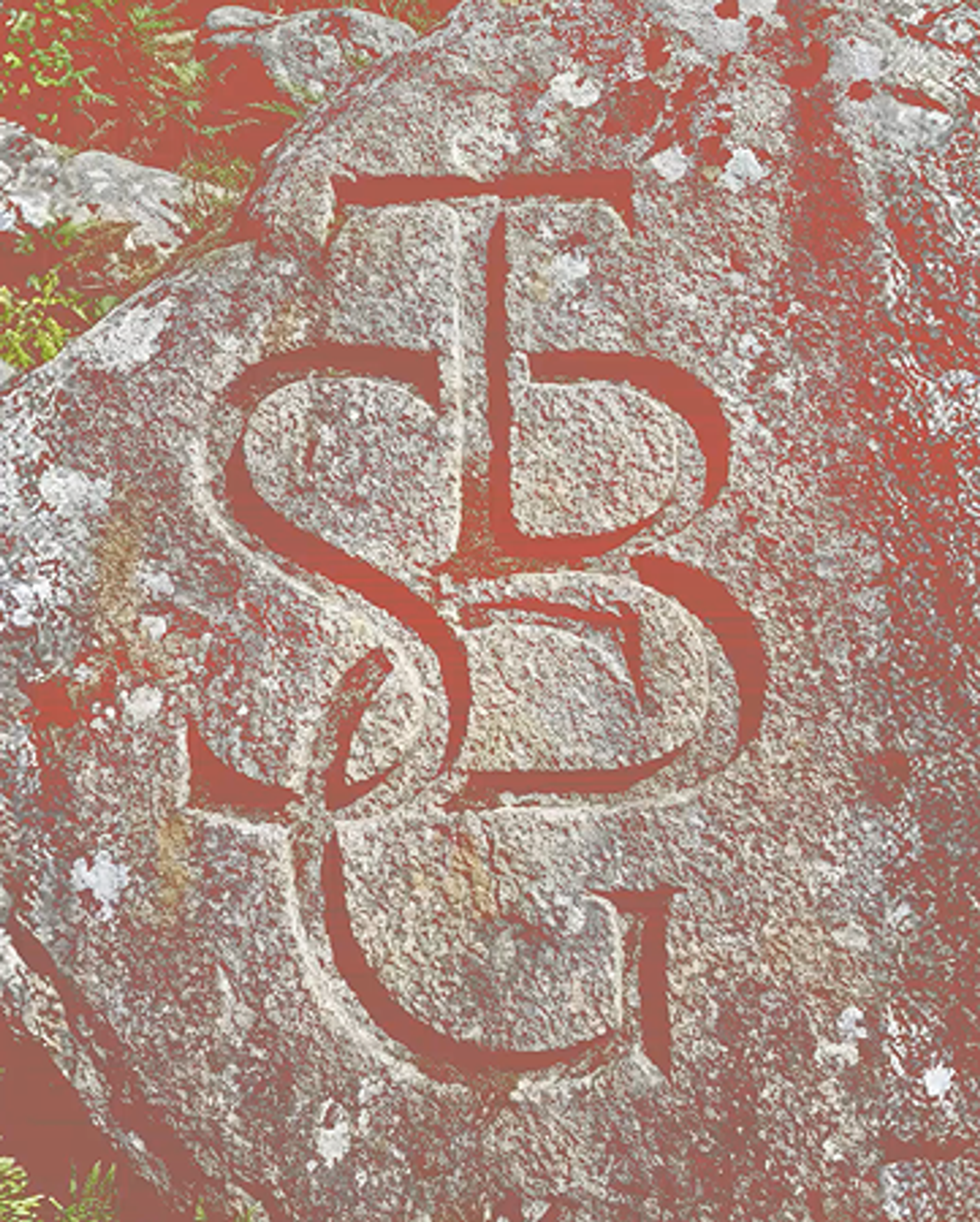
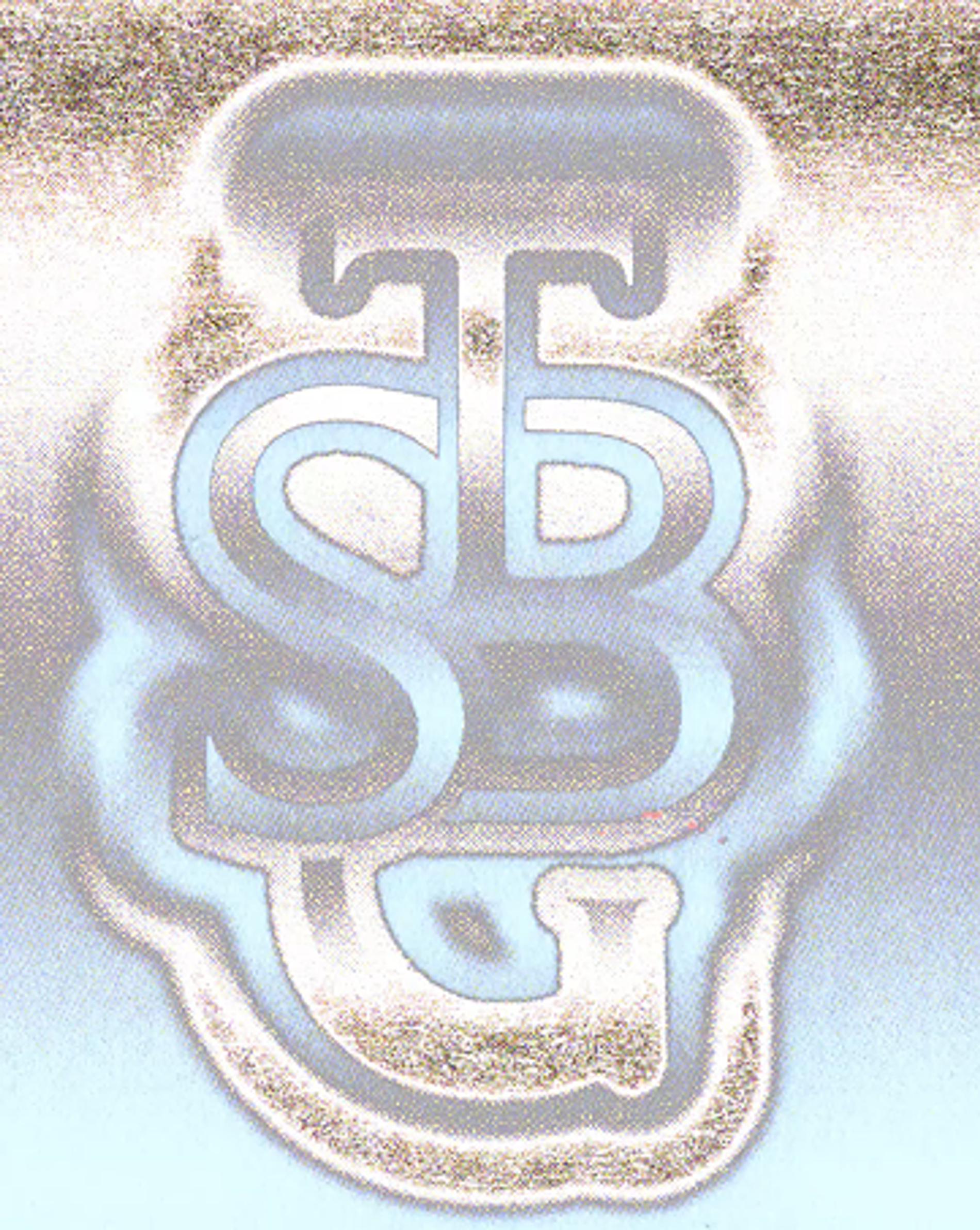
The colour palette was built to hold the tension between system and rupture, considered enough to feel intentional, charged enough to feel like something that interrupts rather than simply arrives.
THE OUTCOME
Sabotage now has an identity that doesn't illustrate what it does: it demonstrates it. Every element is a strategic decision expressed as visual form. The system functions as a manifesto: an agency that doesn't just talk about hacking methodologies, but builds its own brand by doing exactly that. Anchored in a clear internal logic rather than a fixed aesthetic, the identity is built to scale, adapt and remain coherent as the agency grows.