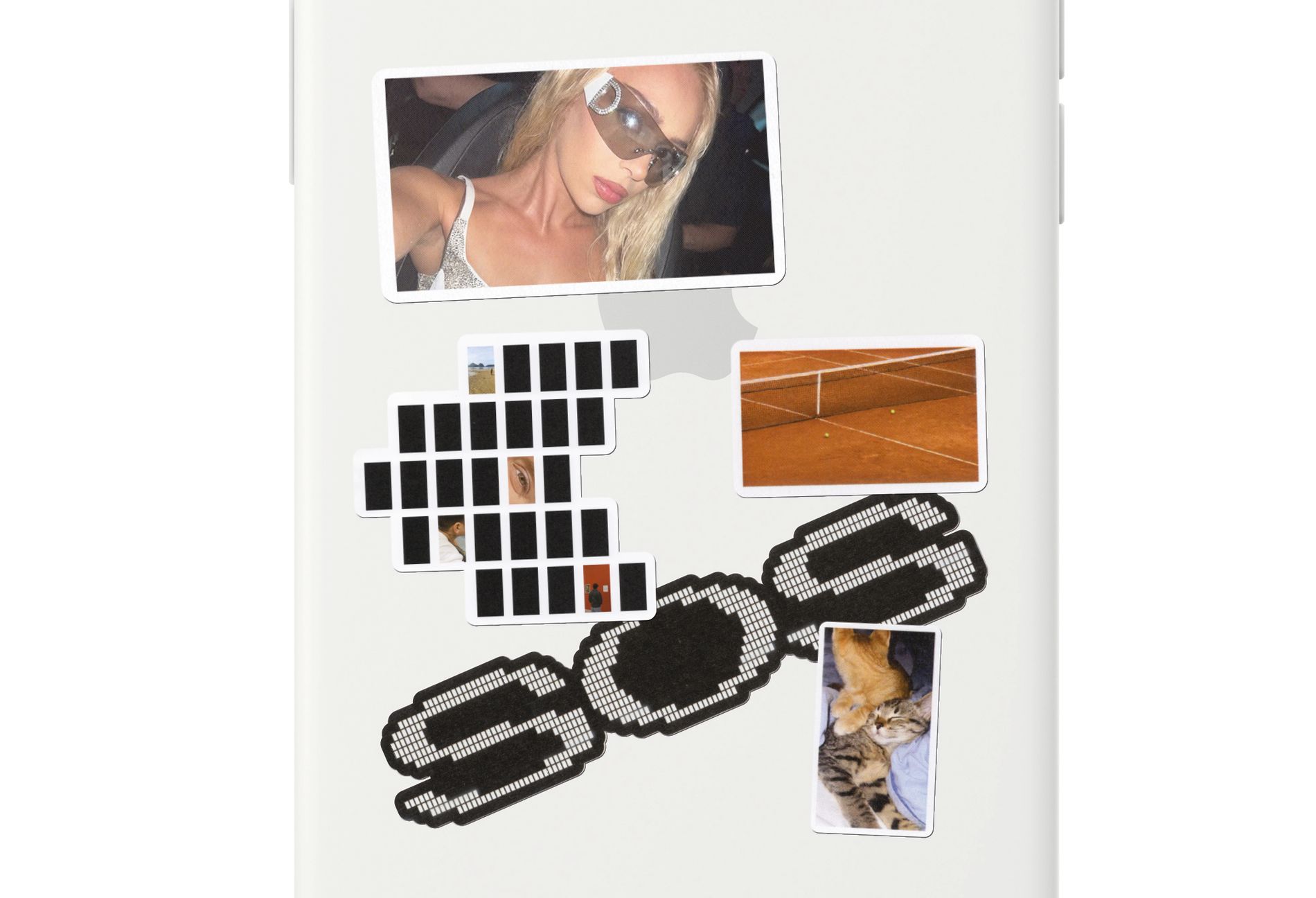
SOS (Stories of Stories) — A graphic system built from the format it interrogates
THE CHALLENGE
A project rooted in the visual grammar of Instagram needed a graphic system that understood that language from the inside. The risk was creating something that commented on social media culture from a distance, producing an identity that felt like an external observation rather than a genuine extension of the material itself.
The design had to inhabit the same world it was reflecting on.
THE APPROACH
Working from the material itself, we identified the most strategic starting point: the 16:9 vertical proportion of the Instagram story format. Rather than treating it as a technical constraint, we took it as the structural foundation of the entire graphic system. Every compositional decision, every layout, every graphic element was derived from that ratio: the same container that holds the stories in the film holds the identity of the film itself.
The system doesn't illustrate the concept from the outside. It is built from it.
THE WORK
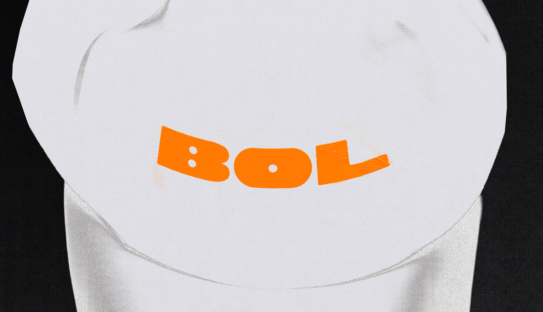
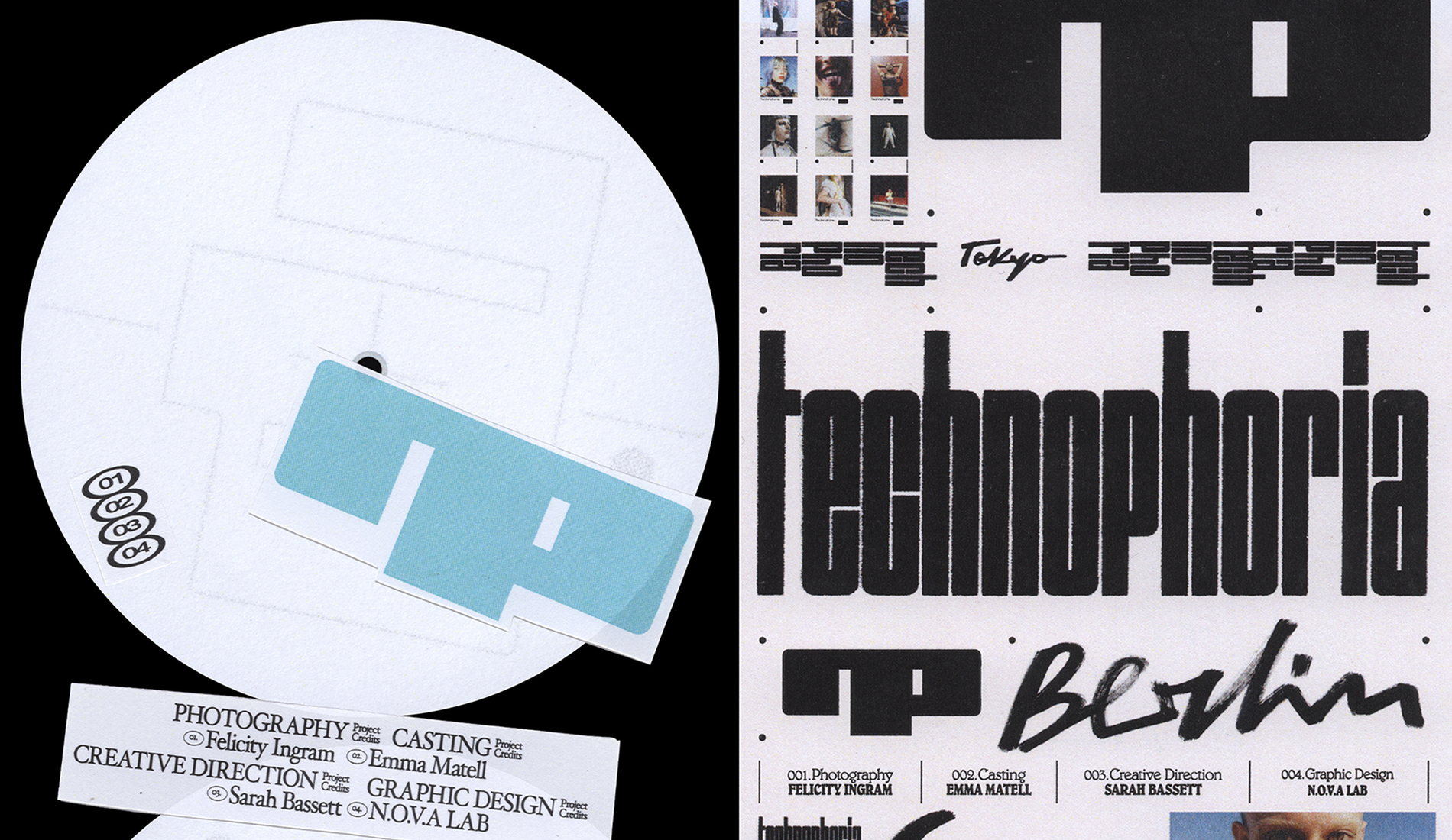
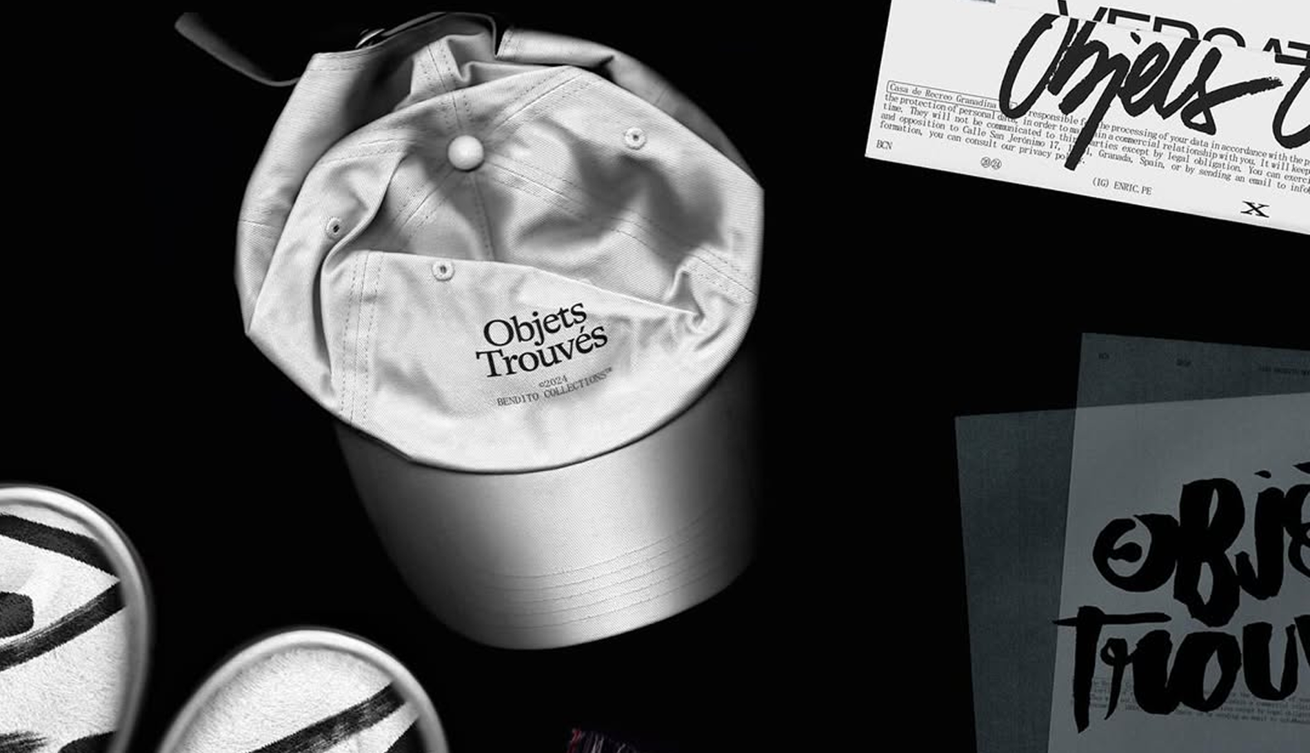
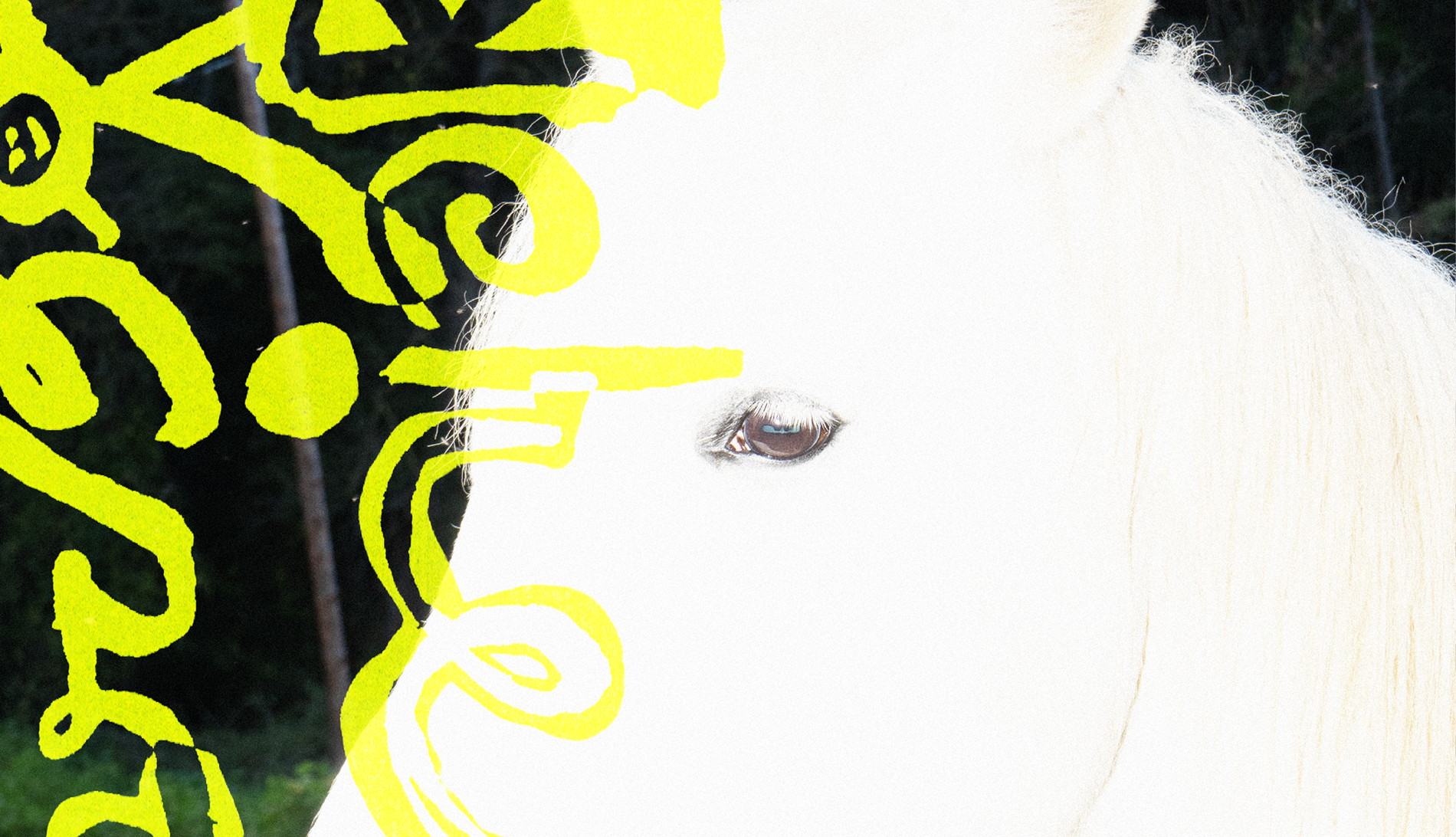
We developed the full visual identity and graphic system for the project, including a custom lettering designed specifically for SOS. Every element was constructed from the 16:9 grid, creating a visual language that bridges the fleeting nature of social media captures with the tangible, physical experience of the screening.
THE OUTCOME
SOS has a graphic identity that is inseparable from its subject. The decision to derive the entire system from the story format transforms a formal constraint into a conceptual statement: a film about what we share, designed with the proportions of the place we share it.