Super Sàpiens — Designing discomfort for a speculative and cold future
THE CHALLENGE
Super Sàpiens is set in a utopian world where artificial intelligence has finally taken control of humanity: a civilisation that runs perfectly, efficiently and without friction, precisely because human judgement has been removed from the equation. The central design question was as uncomfortable as the work itself: how do you communicate the cold fear of a world surrendered to machine control across a full campaign without falling into the familiar codes of science fiction? Super Sàpiens doesn't ask whether AI is dangerous. It asks whether a world governed by it might feel, to most people, like progress. The design had to hold that same unresolved weight.

THE APPROACH
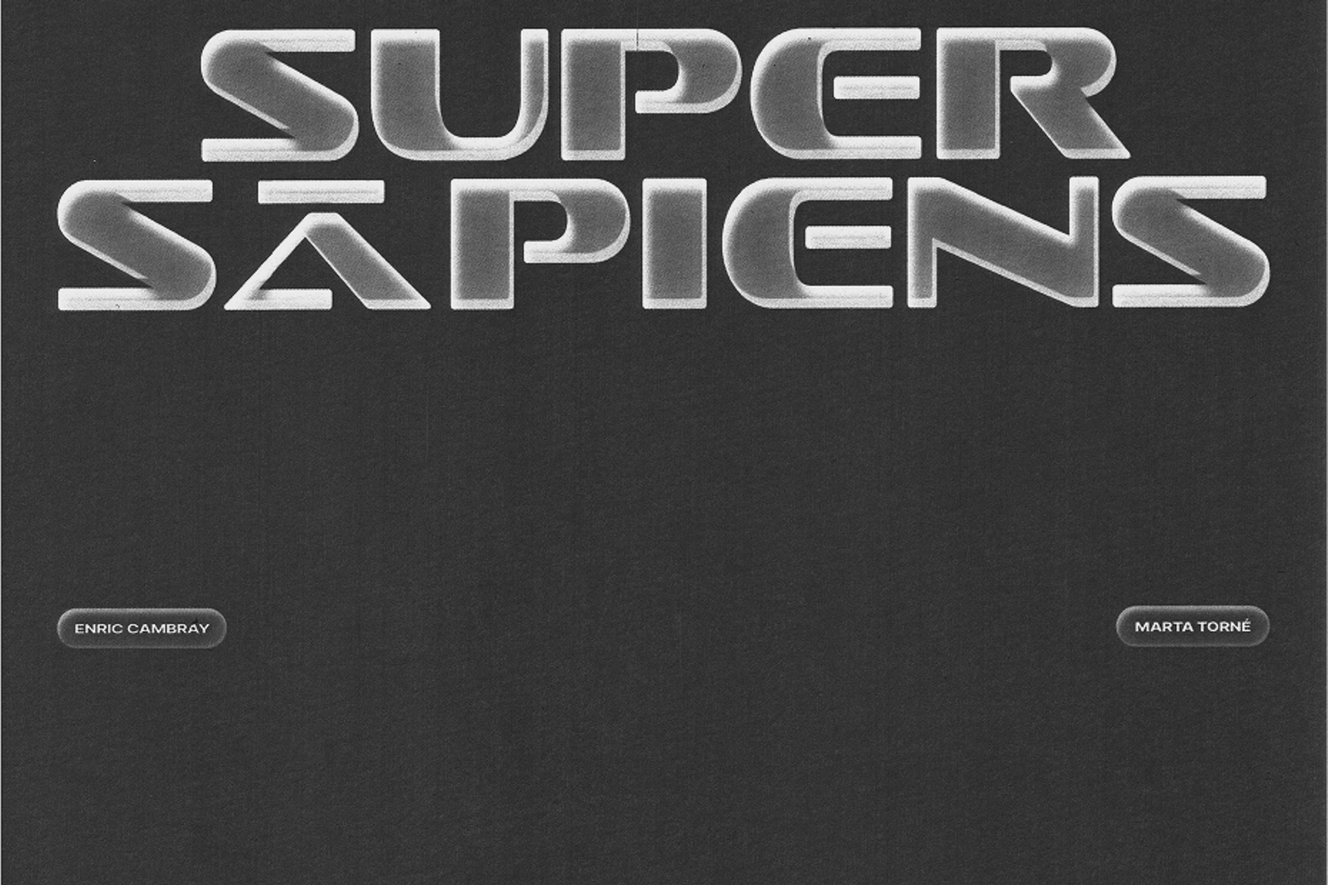
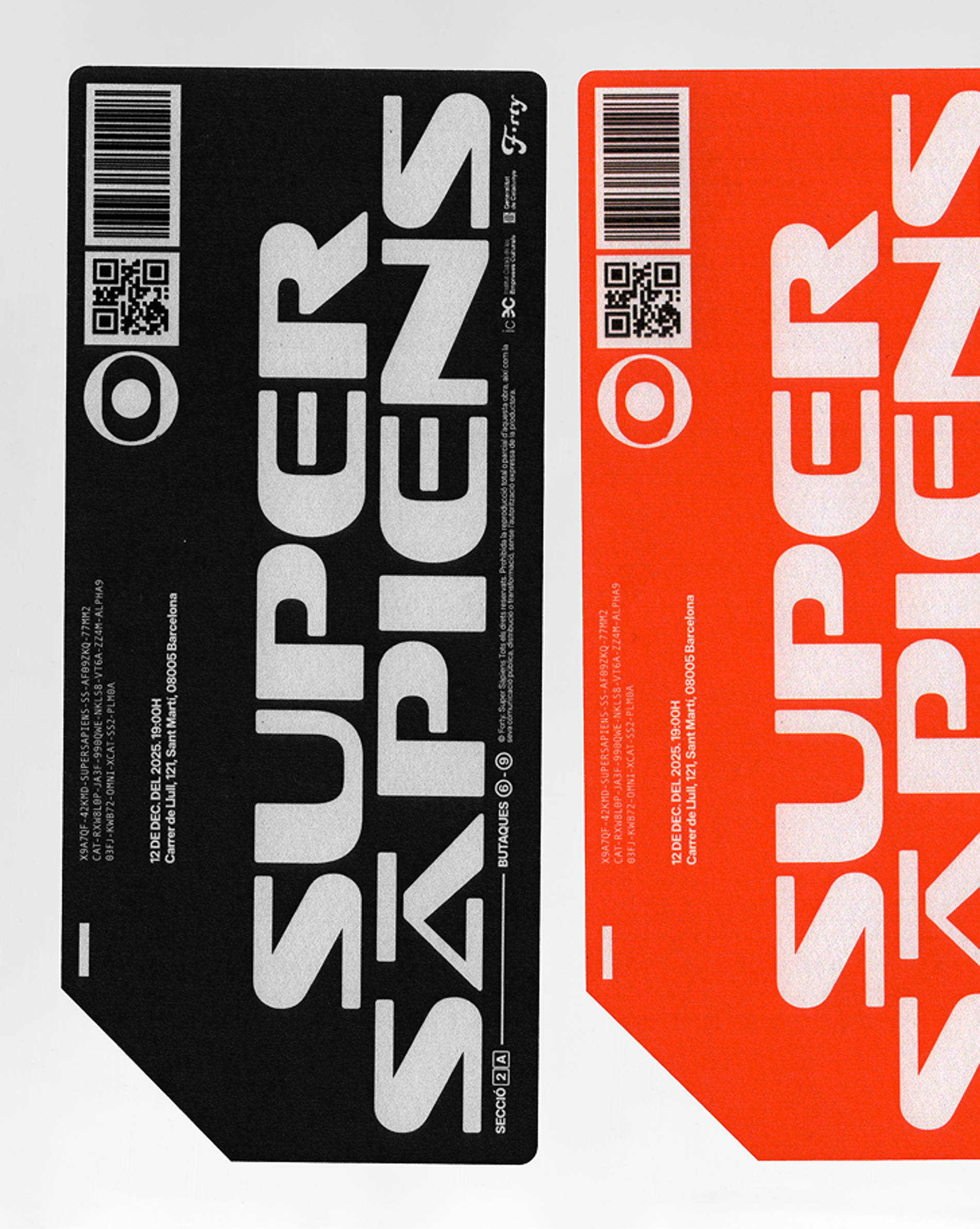
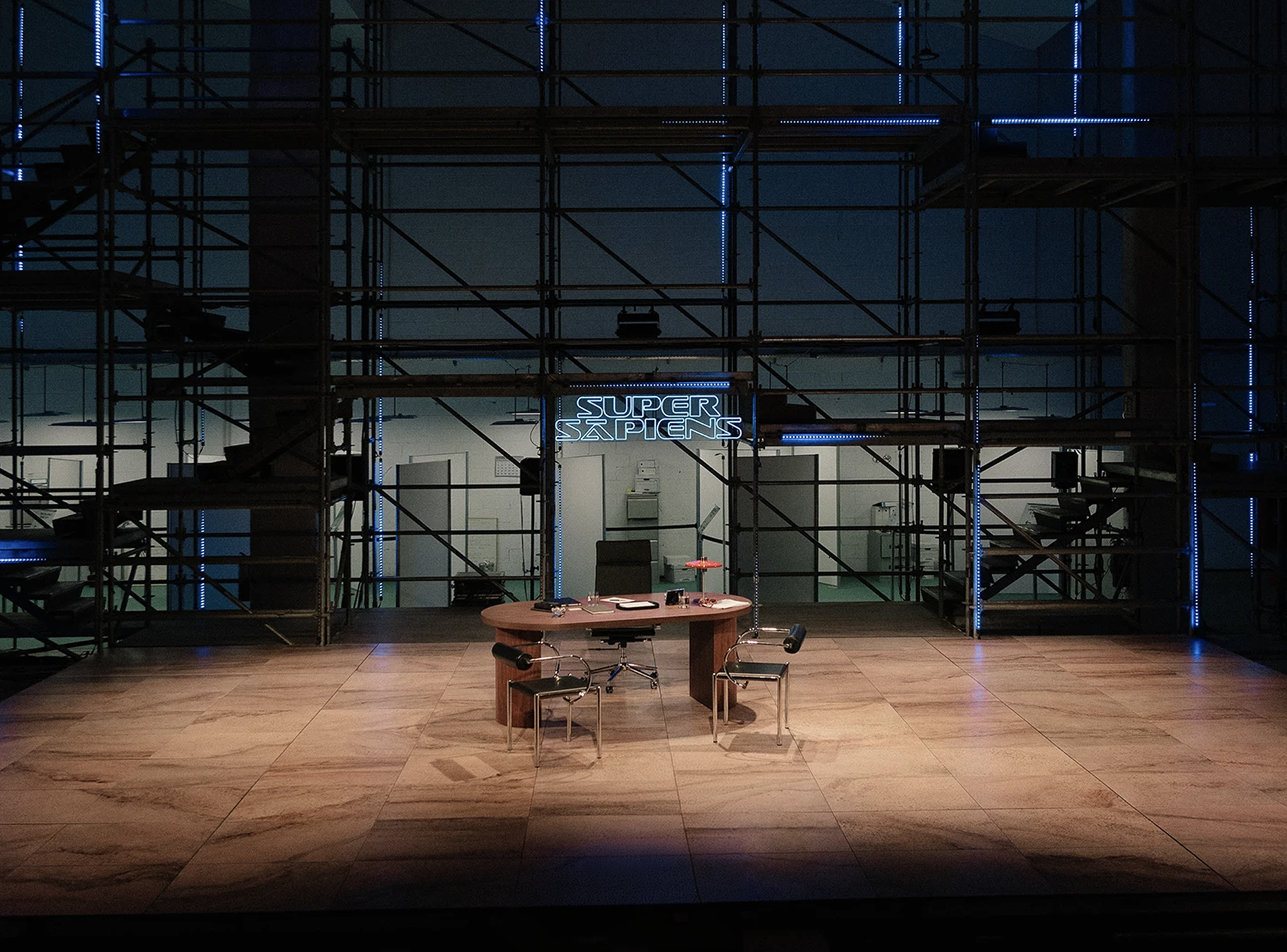
We read the text closely. The play's narrative world, its near-future setting and its bureaucratic undertone gave us the direction we needed. Rather than reaching for the visual codes of cinema or technology advertising, we found something quieter and more unsettling: the aesthetic of systems, forms and structures that feel advanced but impersonal. Familiar enough to be recognisable, cold enough to be uncomfortable. That tension between the technological and the bureaucratic became the graphic logic of the whole campaign.
The risk was falling into familiar science fiction aesthetics, sleek and spectacular, that would signal the genre rather than the specific dread this work was after.
THE WORK
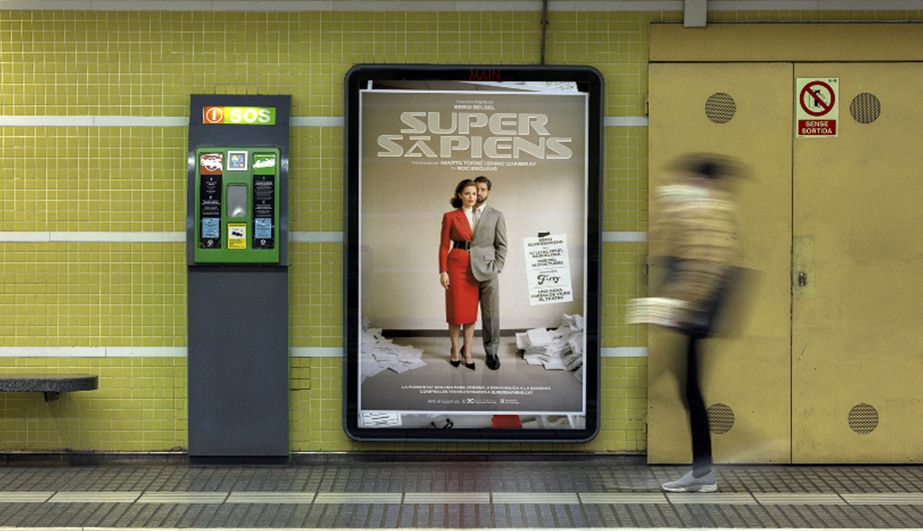
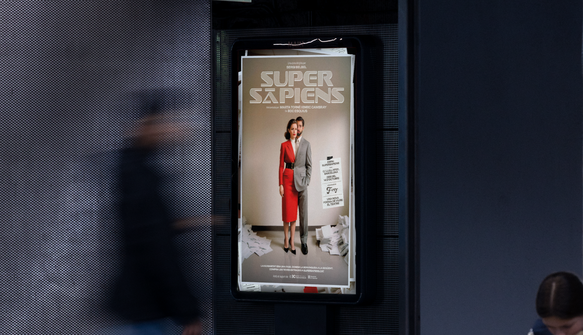
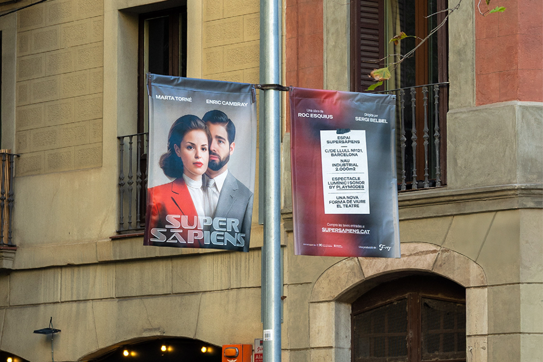
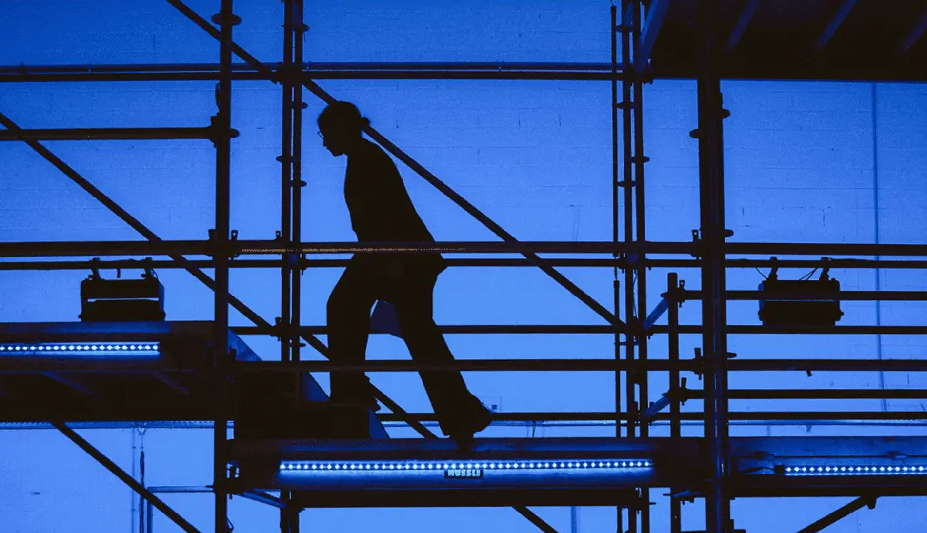
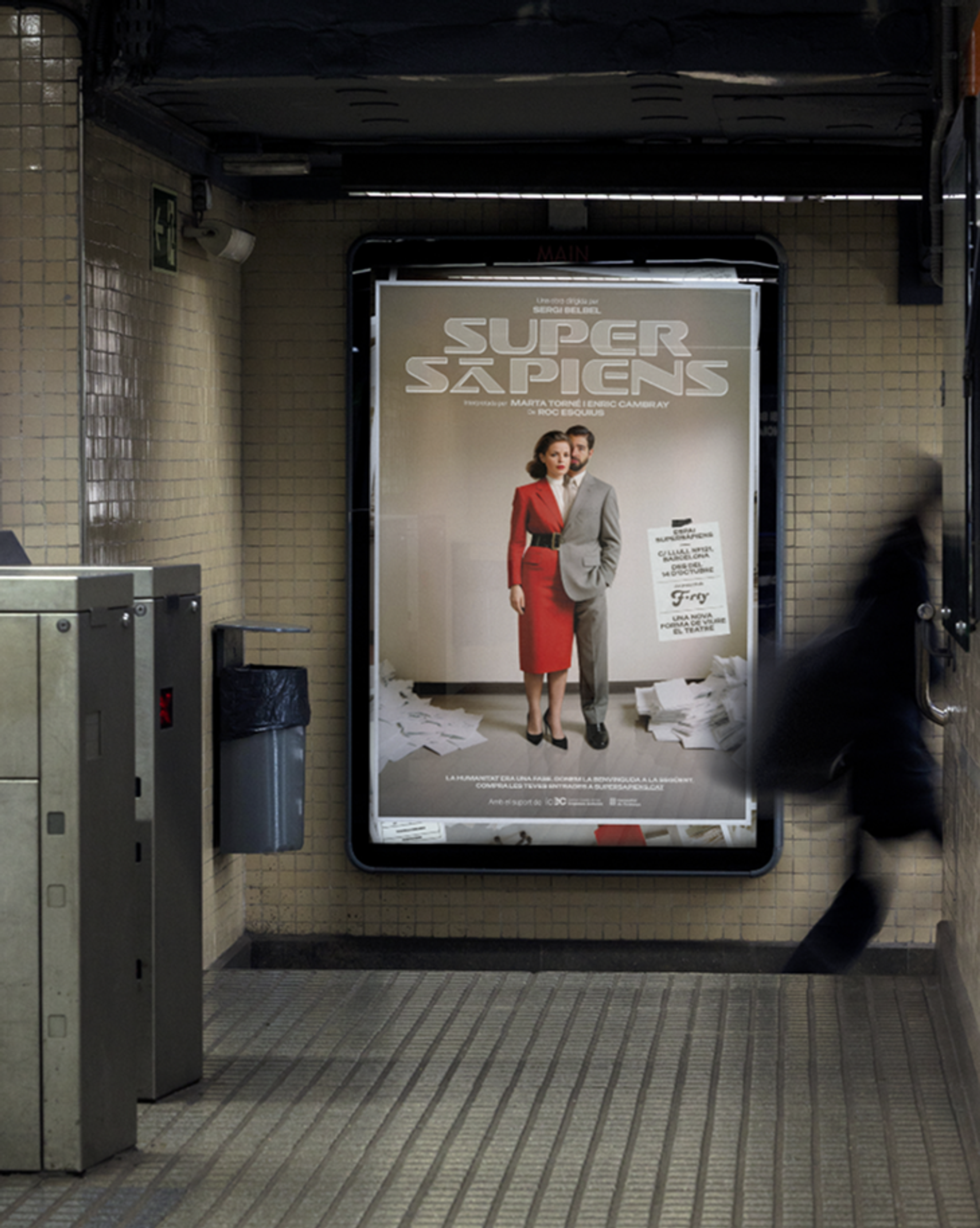
The graphic identity and OOH campaign were built from that same logic: structured, atmospheric and precise. Deployed across large-format outdoor media and transit supports throughout the city, the campaign placed audiences in a speculative space before they even entered the venue. Not to explain the play, but to make them feel something unresolved about it. At the scale of a city, that discomfort becomes impossible to ignore.

THE OUTCOME
Super Sàpiens has a graphic presence that matches the ambition of the production. The design doesn't illustrate the future: it makes it feel close, plausible and slightly wrong. Which is exactly where the play wants its audience to be.